Фирменный стиль и нейминг для студии пилатеса в Канаде PEONYX

About
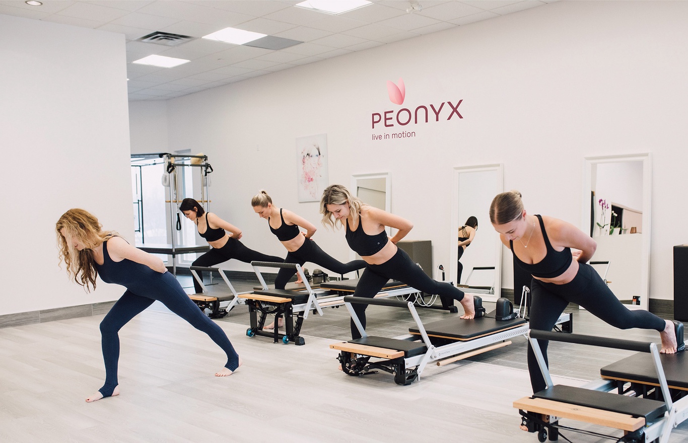
Peonyx Studio offers a completely new approach from the moment a woman enters the studio.
Here she will charge herself with energy, feel her body updated and balanced. Gentle and at the same time effective movements will touch every cell of the body.
A variety of studio programs are suitable for all ages and levels of preparation, including classes on equipment and rugs, strengthening the transverse abdominal muscles, stretching, exercises for pregnant women and recovery after pregnancy, posture restoration and many others.
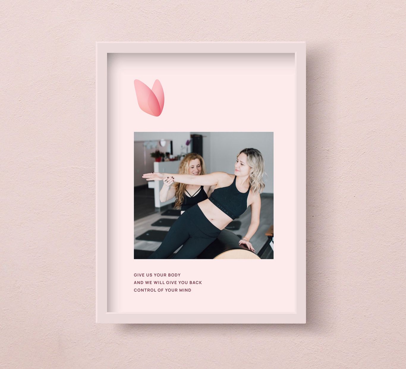
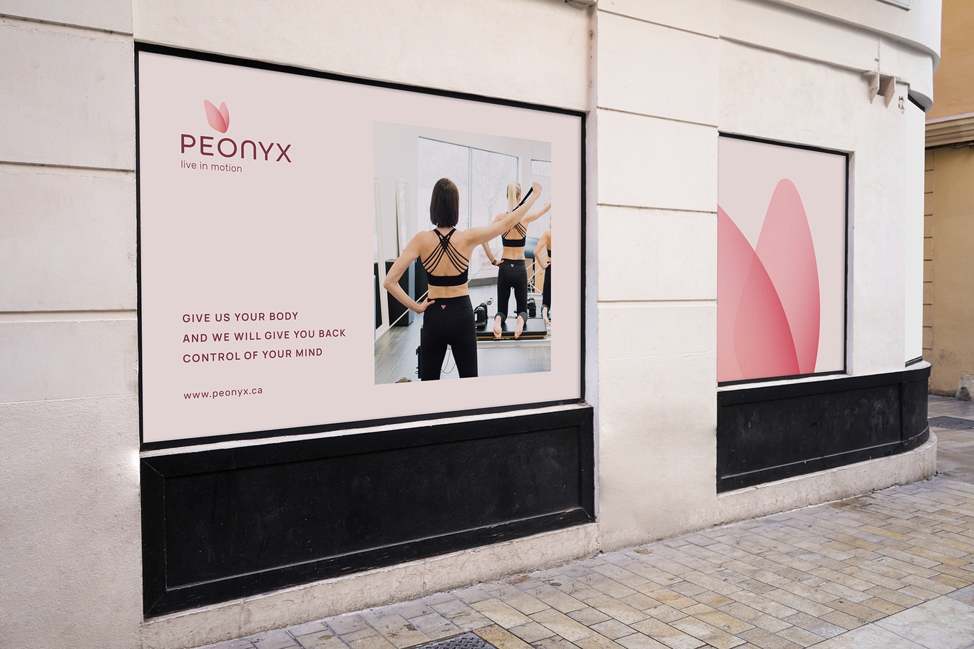
Give us your body and we will give you back control of your mind.
Naming
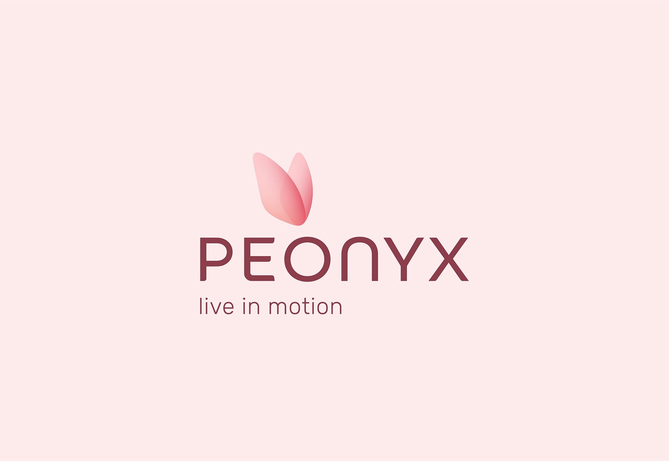
The name is made up of two words - peony + onyx. Peony is a flower, onyx is a stone. The semantics of these words already speaks for itself. This is a combination of femininity and strength, softness and strength, calm and confidence. This is what customers get in the club. They develop the strength of the body, but not forgetting the spirit and femininity. They take control of themselves completely.
Peonies symbolize femininity, romance, beauty, as well as health, since it was the peony god who cured other gods. Onyx is the stone from which the world is made. It also has healing properties - it takes away all the negativity and weakness. It’s also a stone of wrestlers, it concerts energy and makes it self-confident.
Peonyx is a combination of mind and body.
The descriptor - live in motion. Move forward and do not stop. Love yourself and your body. Never regret anything, do not look back and do not try to look into the future, live today, live in motion.
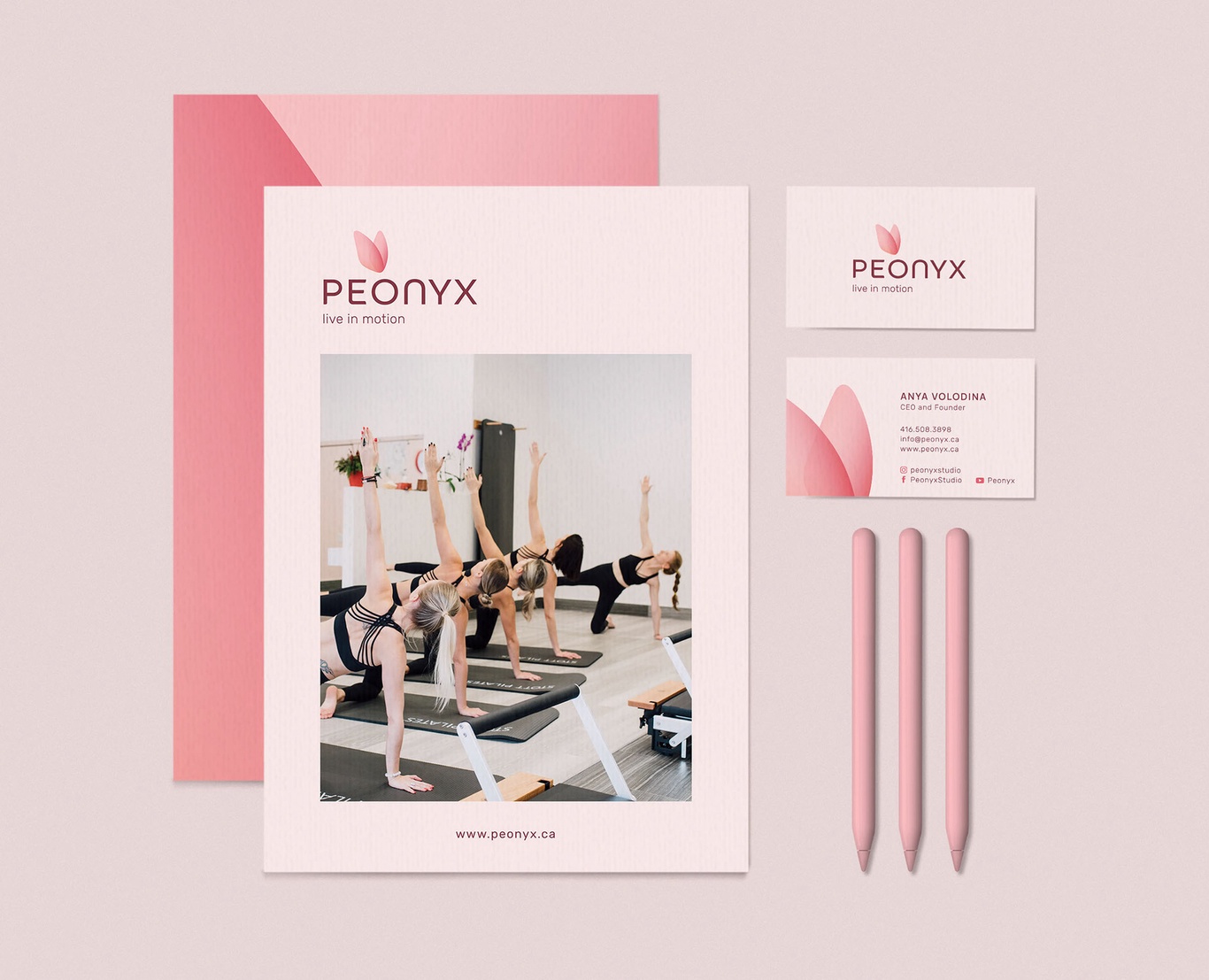
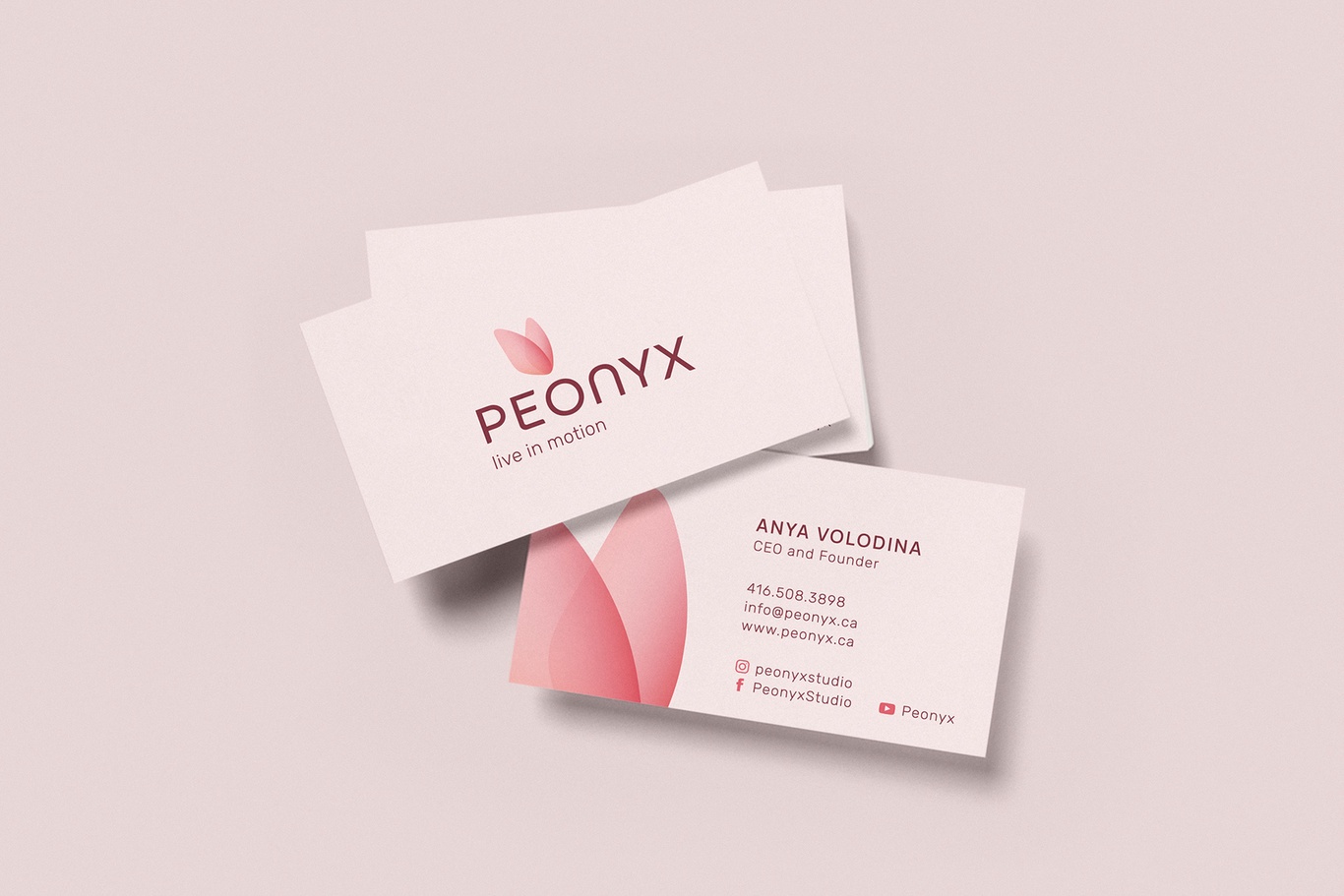
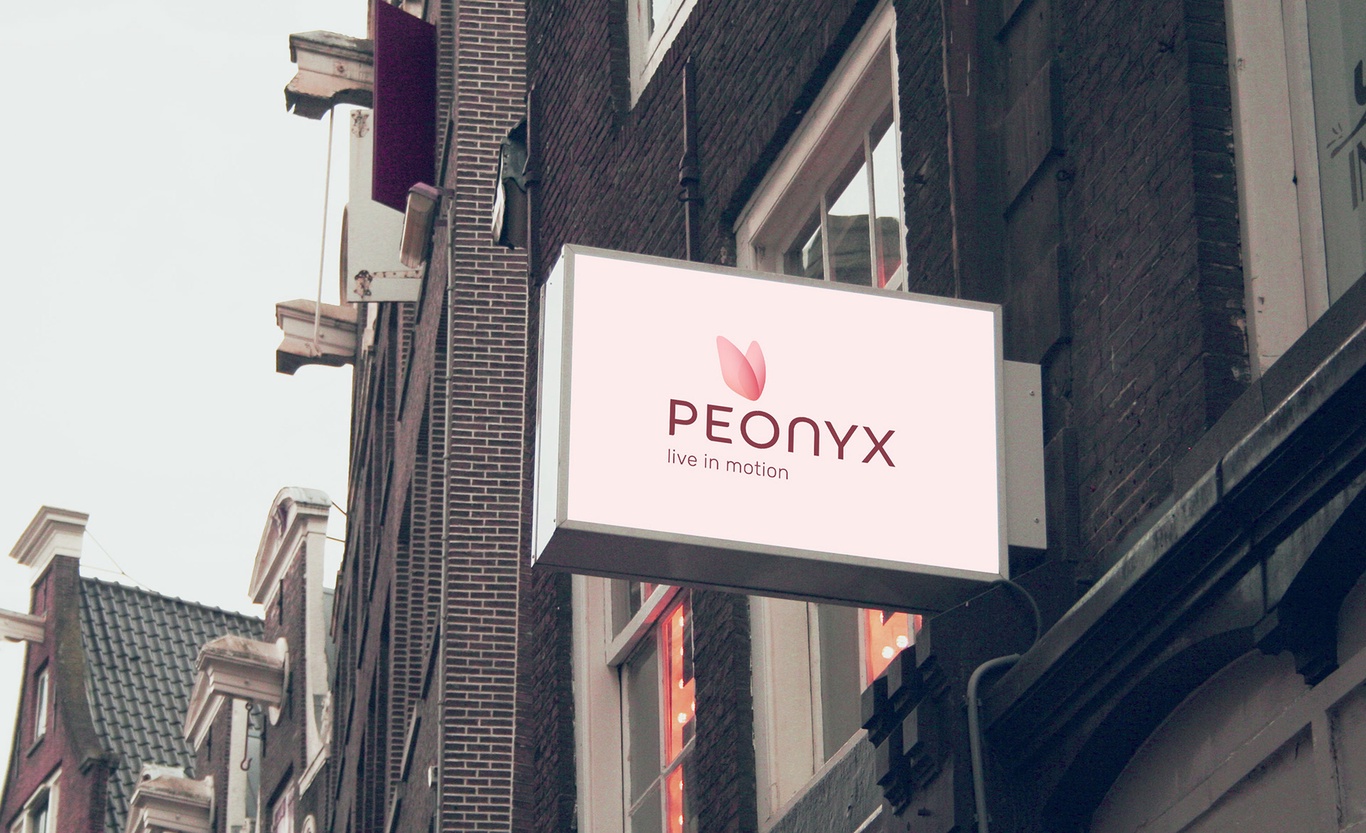
Brand identity
The corporate identity continues the idea that lies in the name of the studio - combination of strength and femininity.
The details of the symbol are a reference to the stone that is on the ring of the founder of the studio. The shape of the stone resembles a butterfly's wing and a second “wing” is added for the complete image. The stone means strength, the butterfly means femininity, and it is also a symbol of the soul, rebirth, the ability to transform. It is also symbolic that the butterfly flies up to the letter O, the letter that connects two words that form the name of the studio.
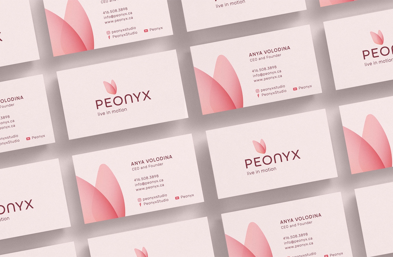
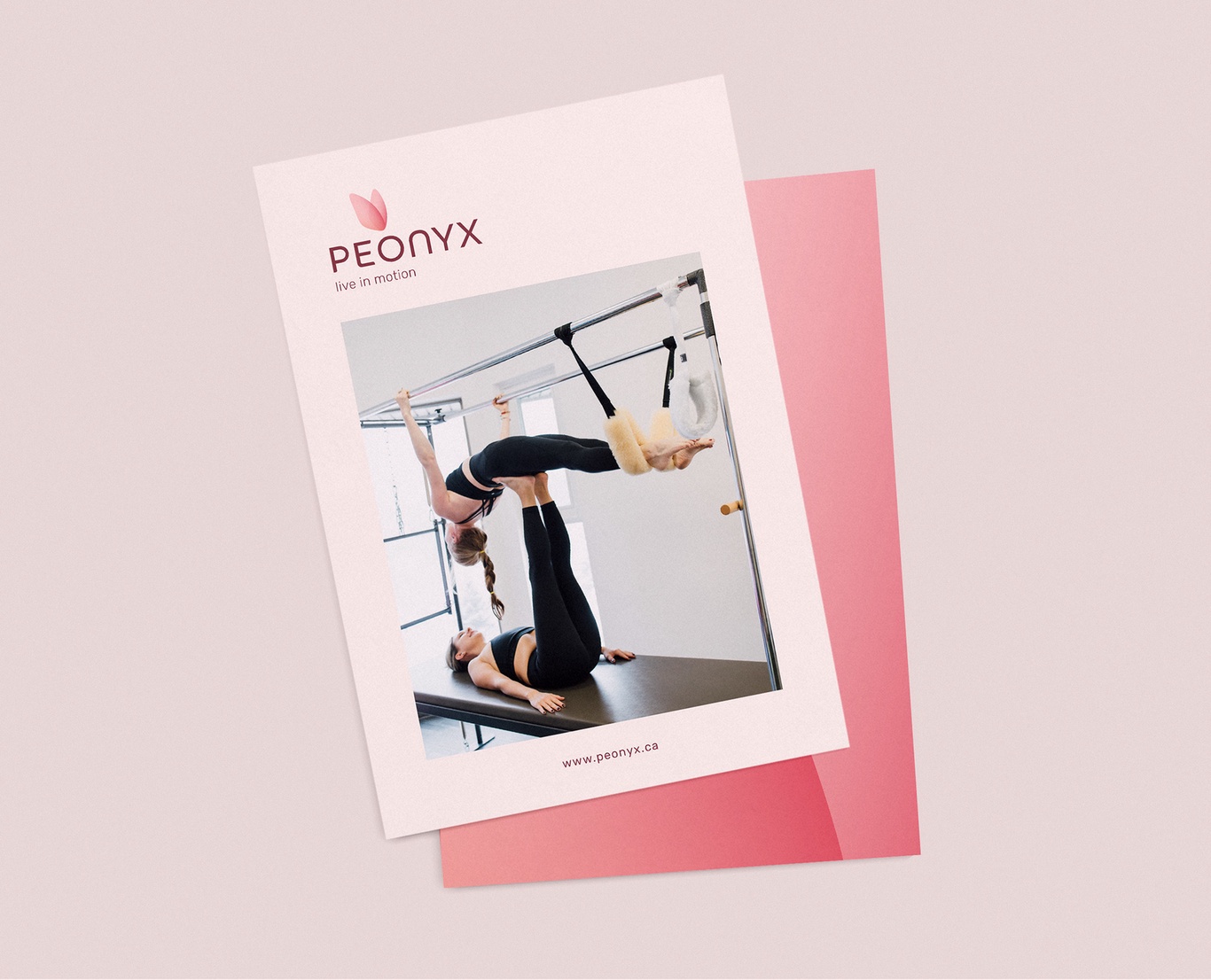
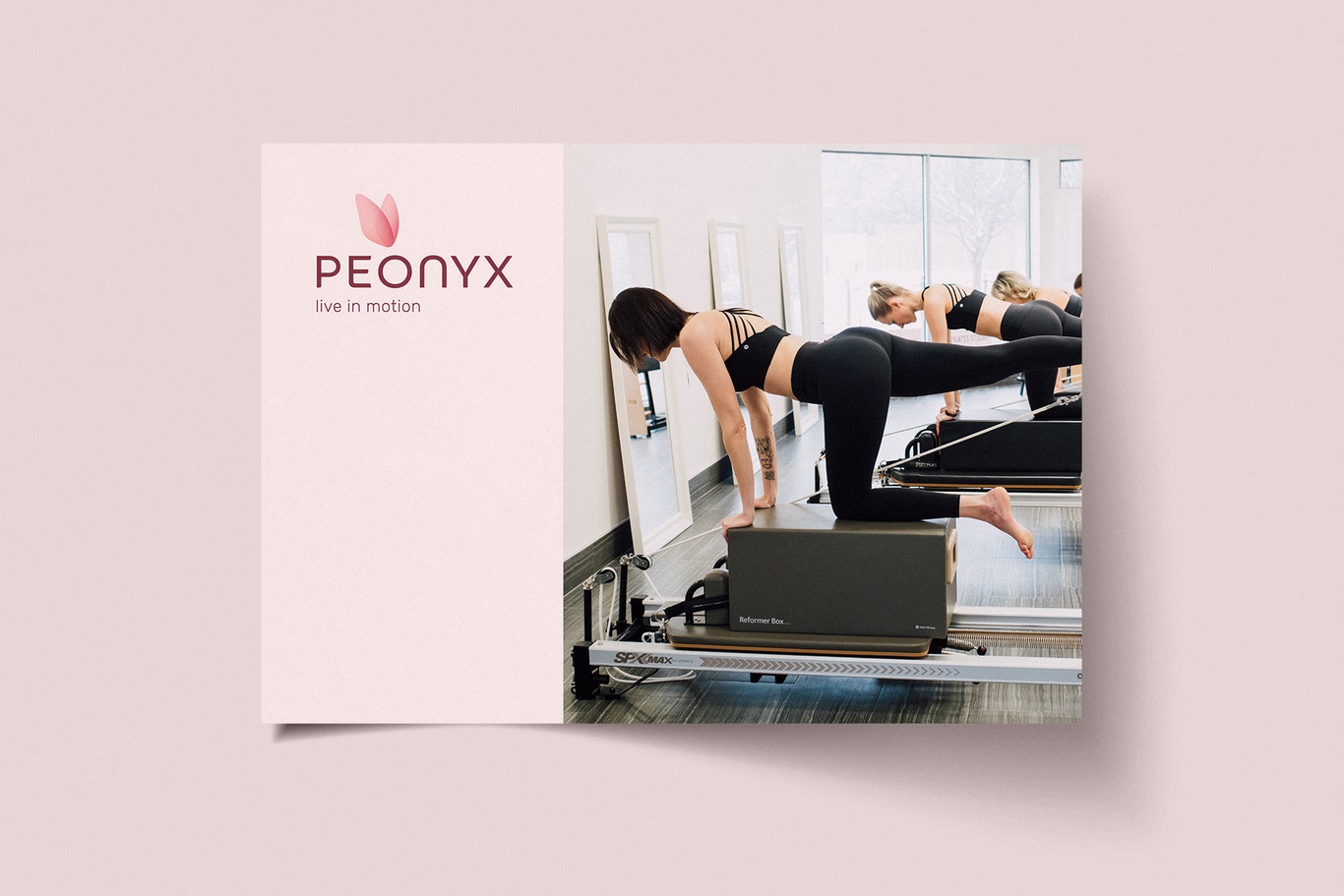
The color palette also reveals the feminine aspect of the image. Delicate floral shades like peony petals envelop us with warmth and care, thereby creating an atmosphere of sensuality and security, in which a woman can open up and find her inner strength.