Chéri bar & store

Никита Жбанов
·
·
811
Chéri bar & store – brand identity by Hardy Branding
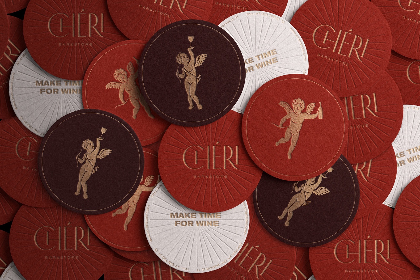
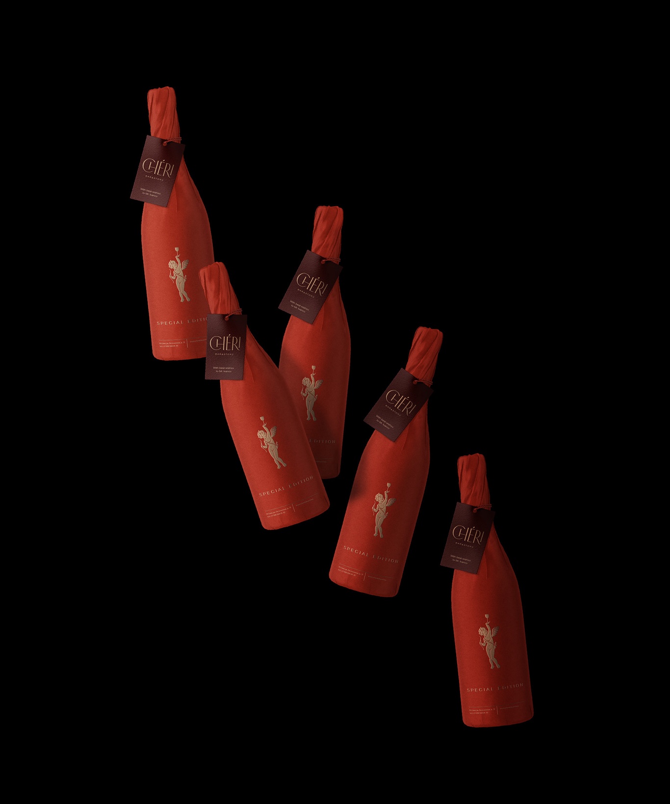
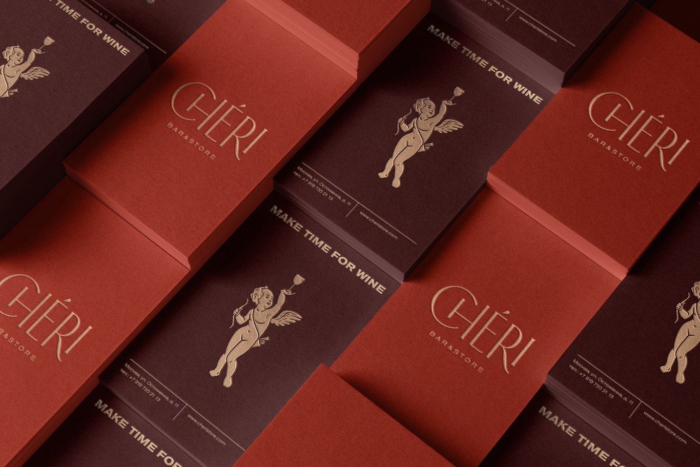
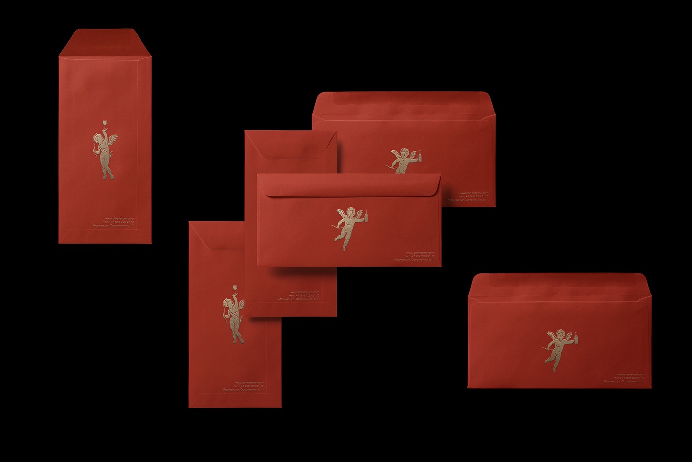
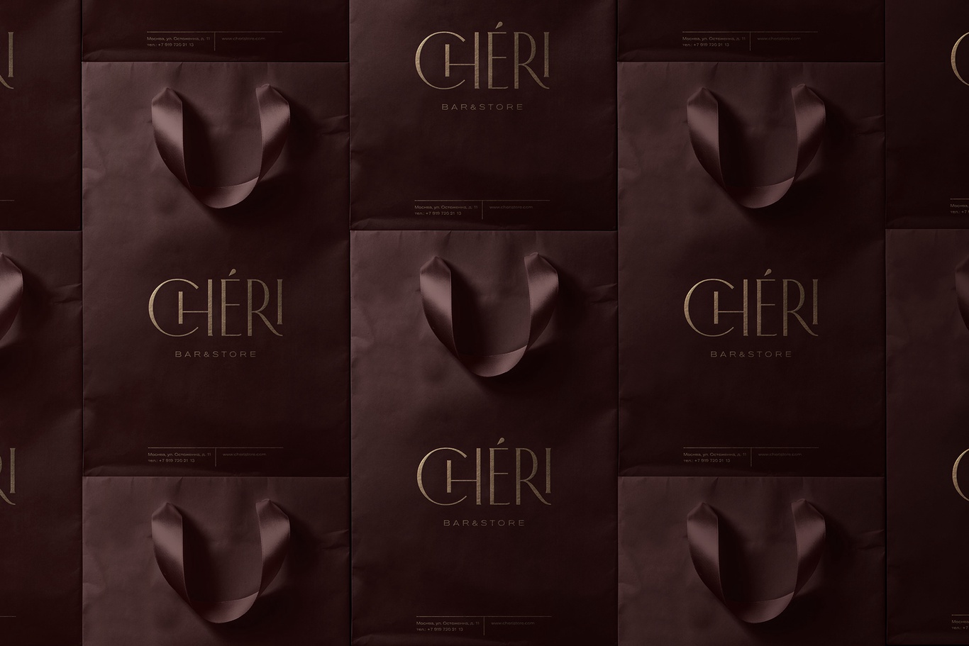
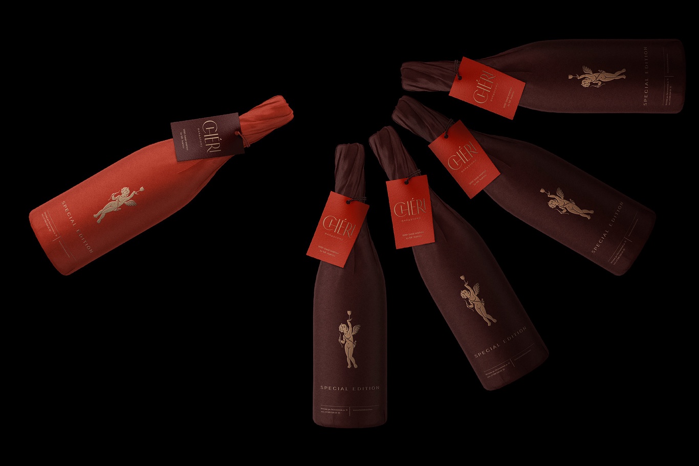
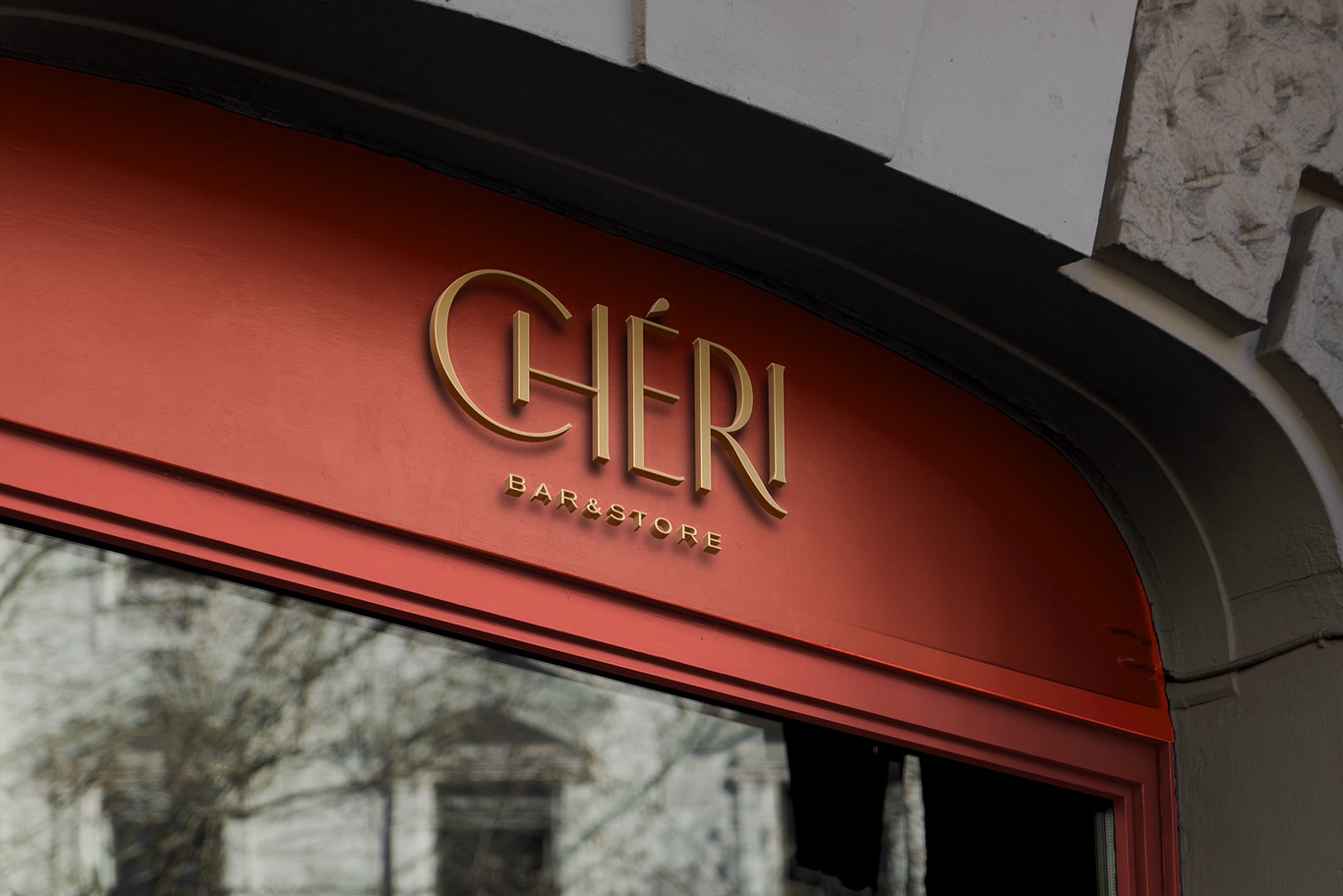
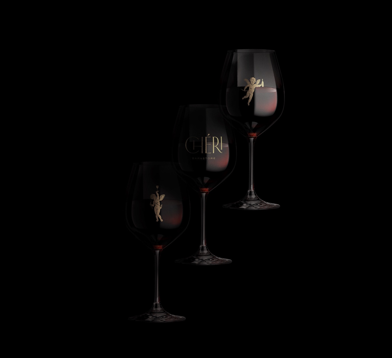
Chéri is a new wine bar and store in the most prestigious neighborhood in Moscow. For Chéri’s brand identity we took inspiration found from two chic periods of French history: La Belle Époque and Roaring twenties. The bar was named after the famous French novel of twenties by Colette. We developed elegant and refined logo and created two brand characters - Cupids. On the top of the logo l’accent aigu has a shape of wine drop and cupids are pictured with wine glass and bottle. According to the brand legend glass and bottle in Cupids hand are always full and wine is never ending. Brand colors are appealing to French Art Nouveau posters.
Branding, Chéri Moscow (RU)