Tyumen City Brand
Brand Platform / Visual identity / Communication
Client: Government of Tyumen
Tyumen / 2020
Strategy & Art-direction: Александр Назаров
Design: Дмитрий Сырпин
Brand video: Мария Бушуева

Tyumen is the city where Siberia begins. Developing, ambitious with European business traditions and Siberian character. People of different social status, cultures and nationalities live here. Already successful professionals and young professionals. Promising scientists, actors, musicians and aspiring street art artists. A city where everyone can start their life, the path of success, self-improvement, traditions, family and keep it in themselves for many years.

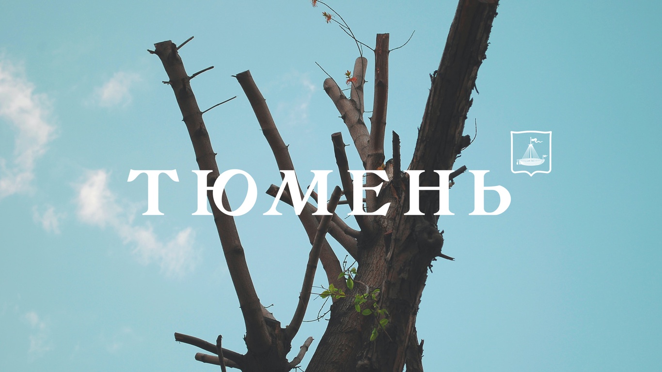

We have built a creative concept on the principle of a gradient from old to new, from conservative to developing, from classic to modern, using various graphic and visual techniques (fonts, photographs, colors).
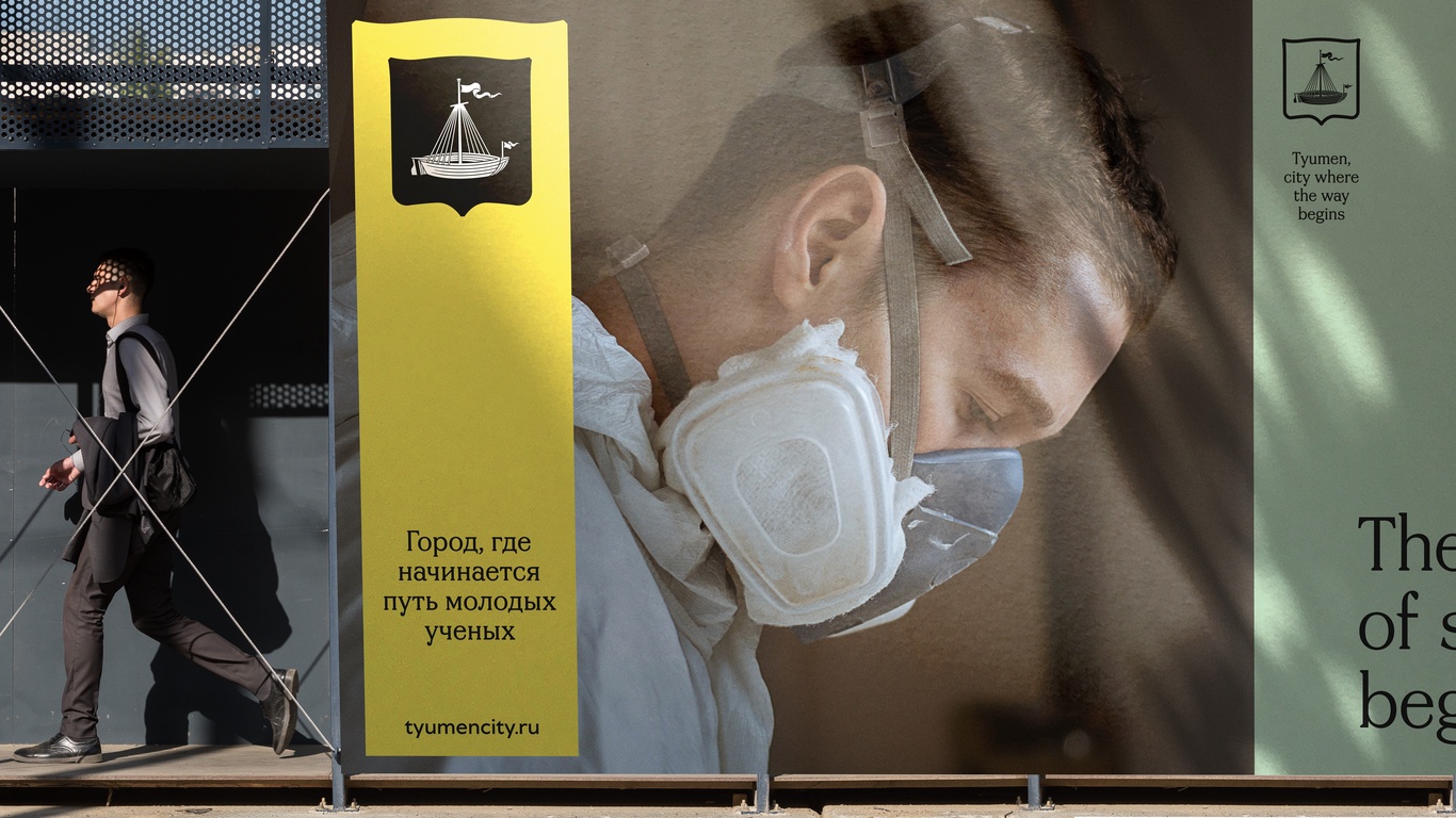
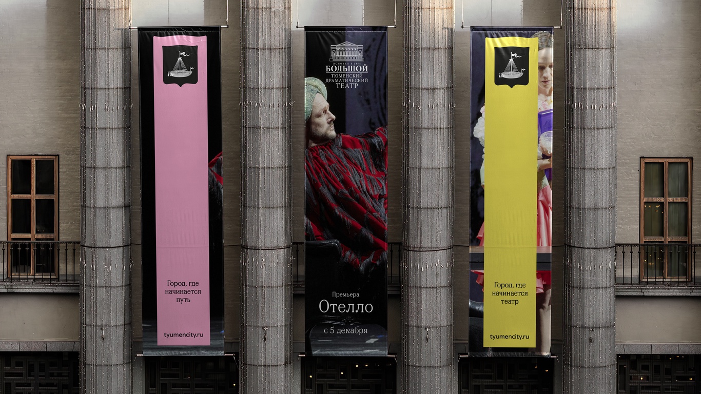
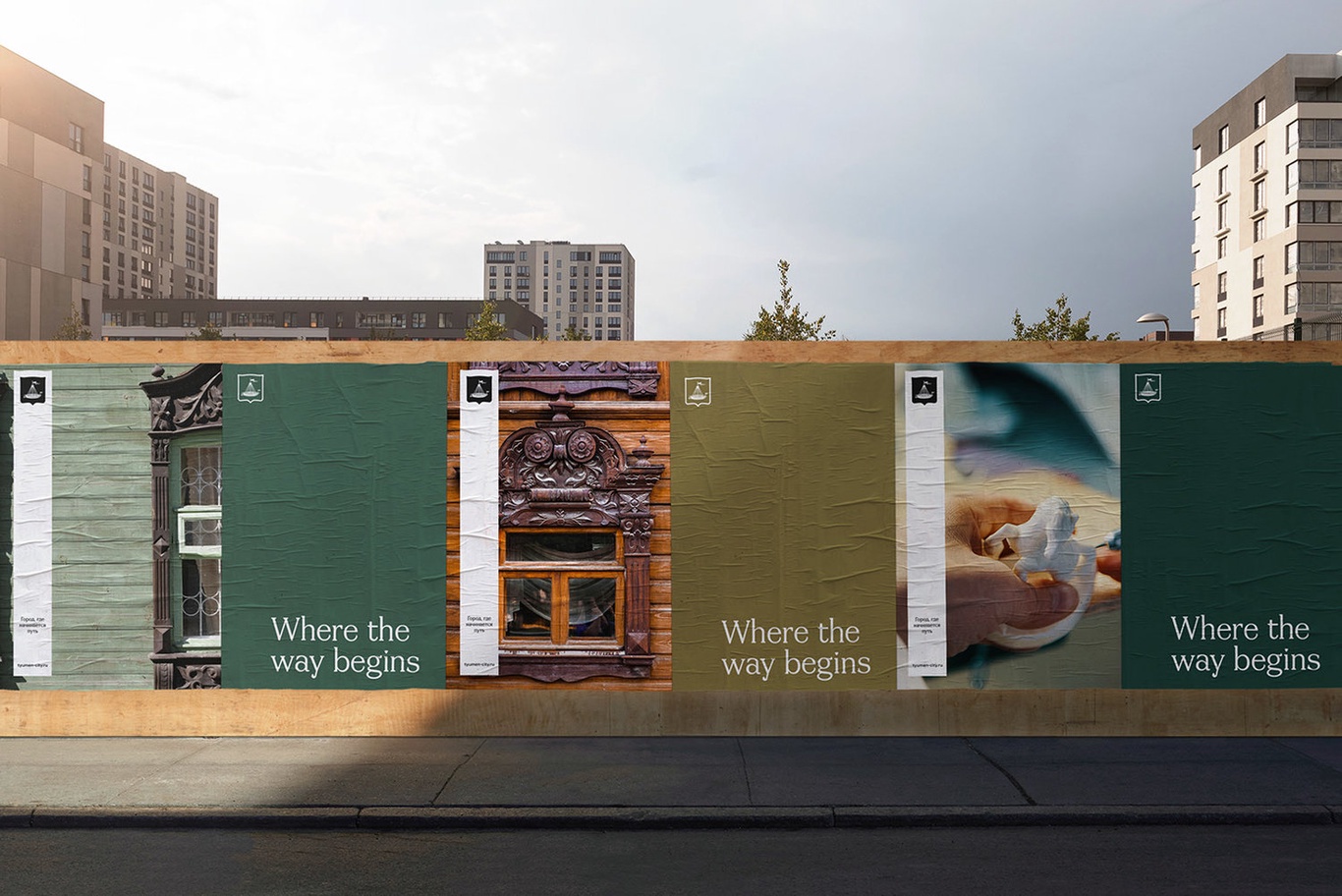
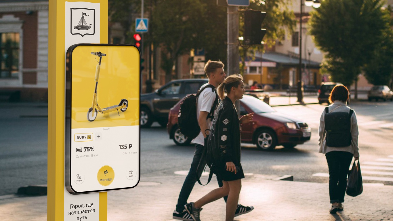
We also developed communication: The city where the way begins ...
The way of personality. The way of development, self-improvement, success, family ...
The way of the profession. The way of an artist, scientist, politician, actor ...
Scope way. In sports, science, theater ...
The way of culture. The beginning of traditions, Siberia, history.

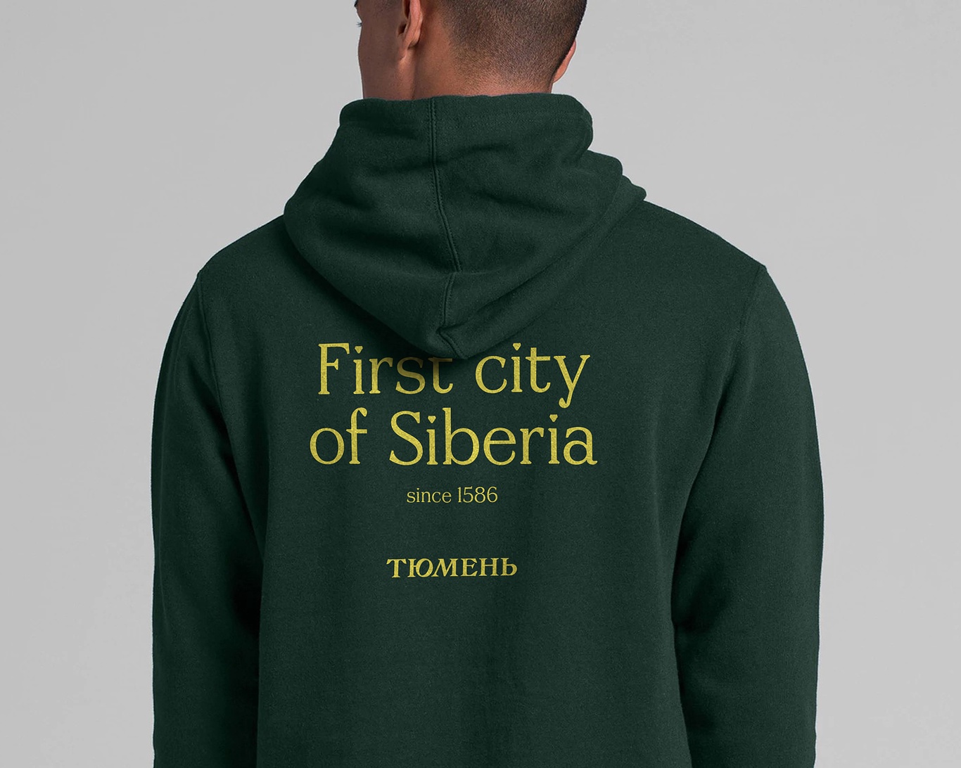
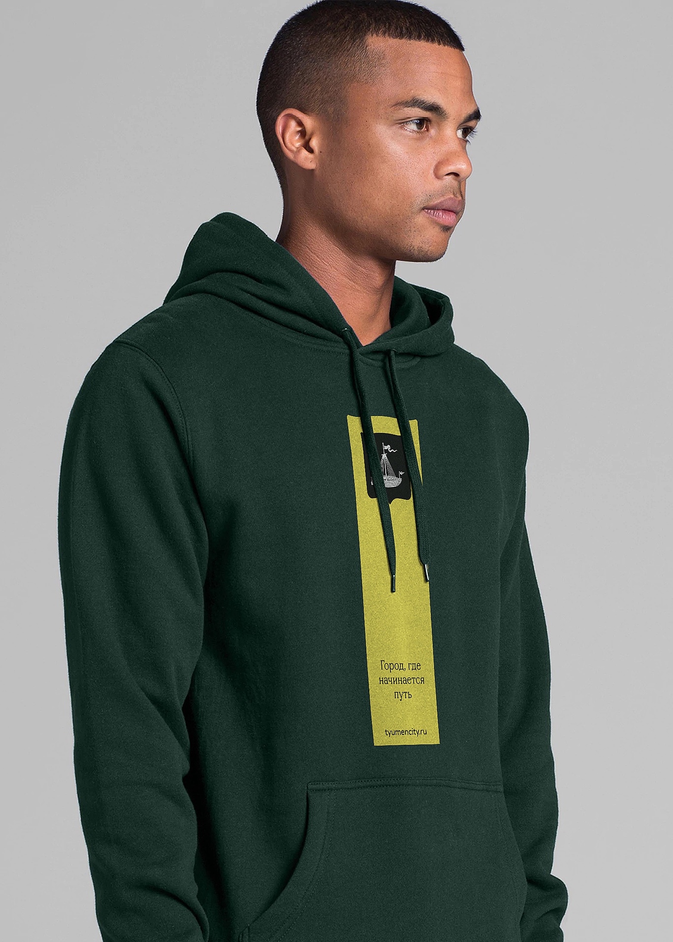
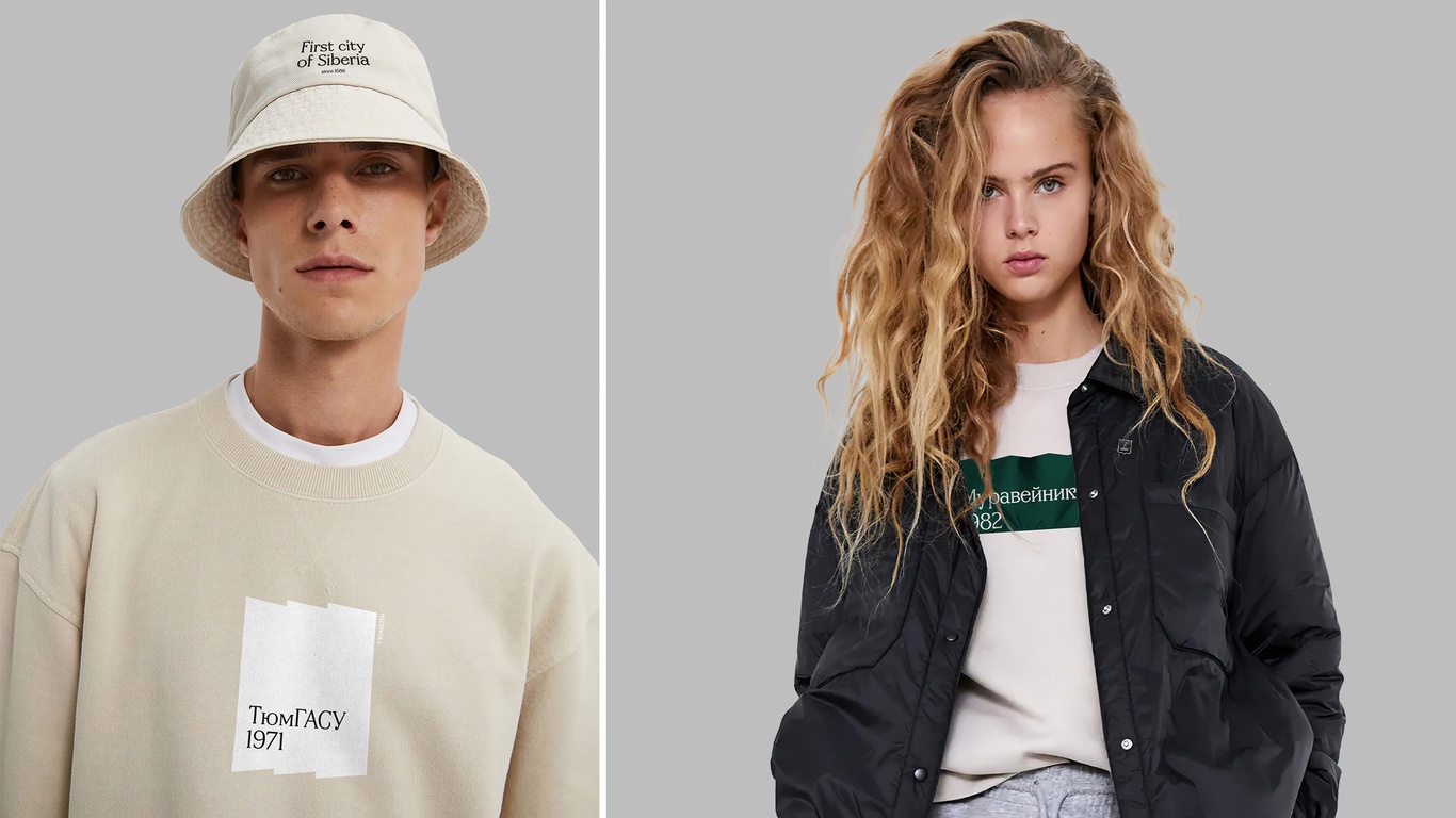
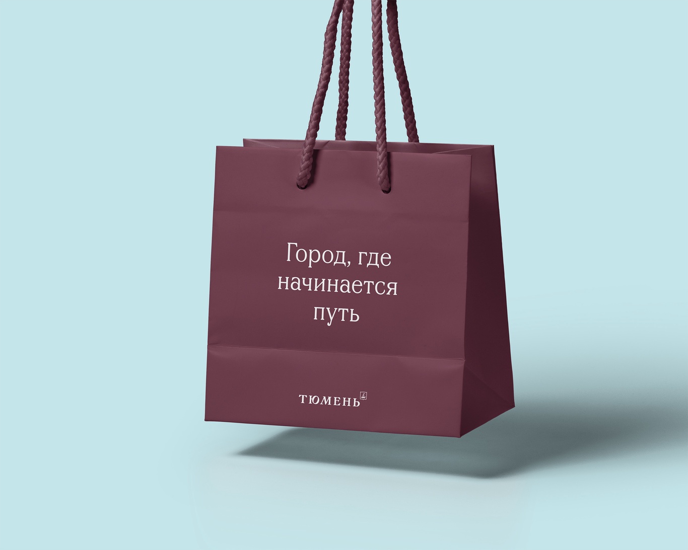
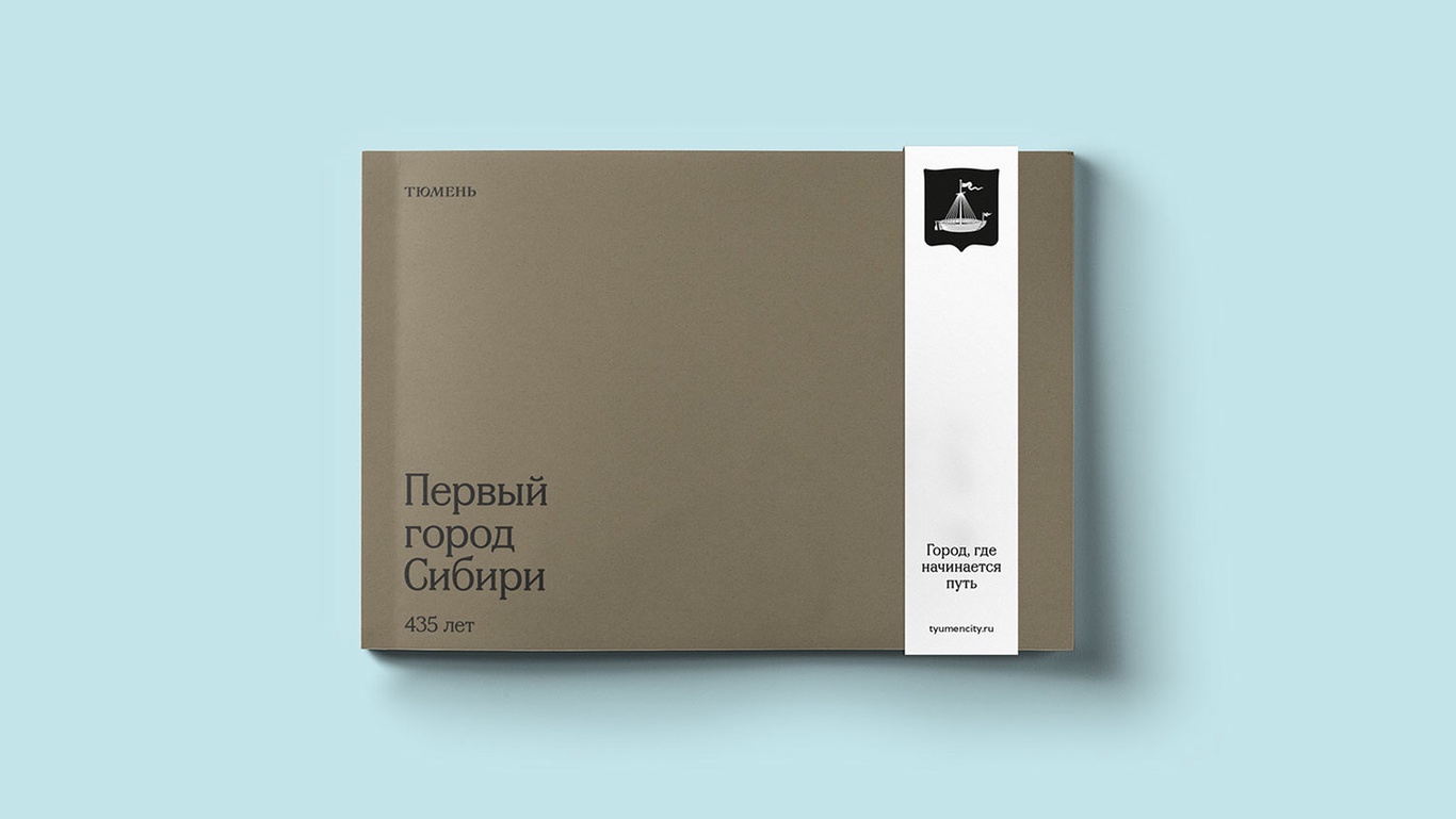
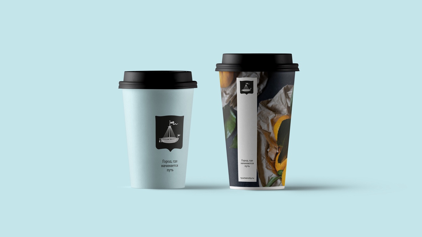
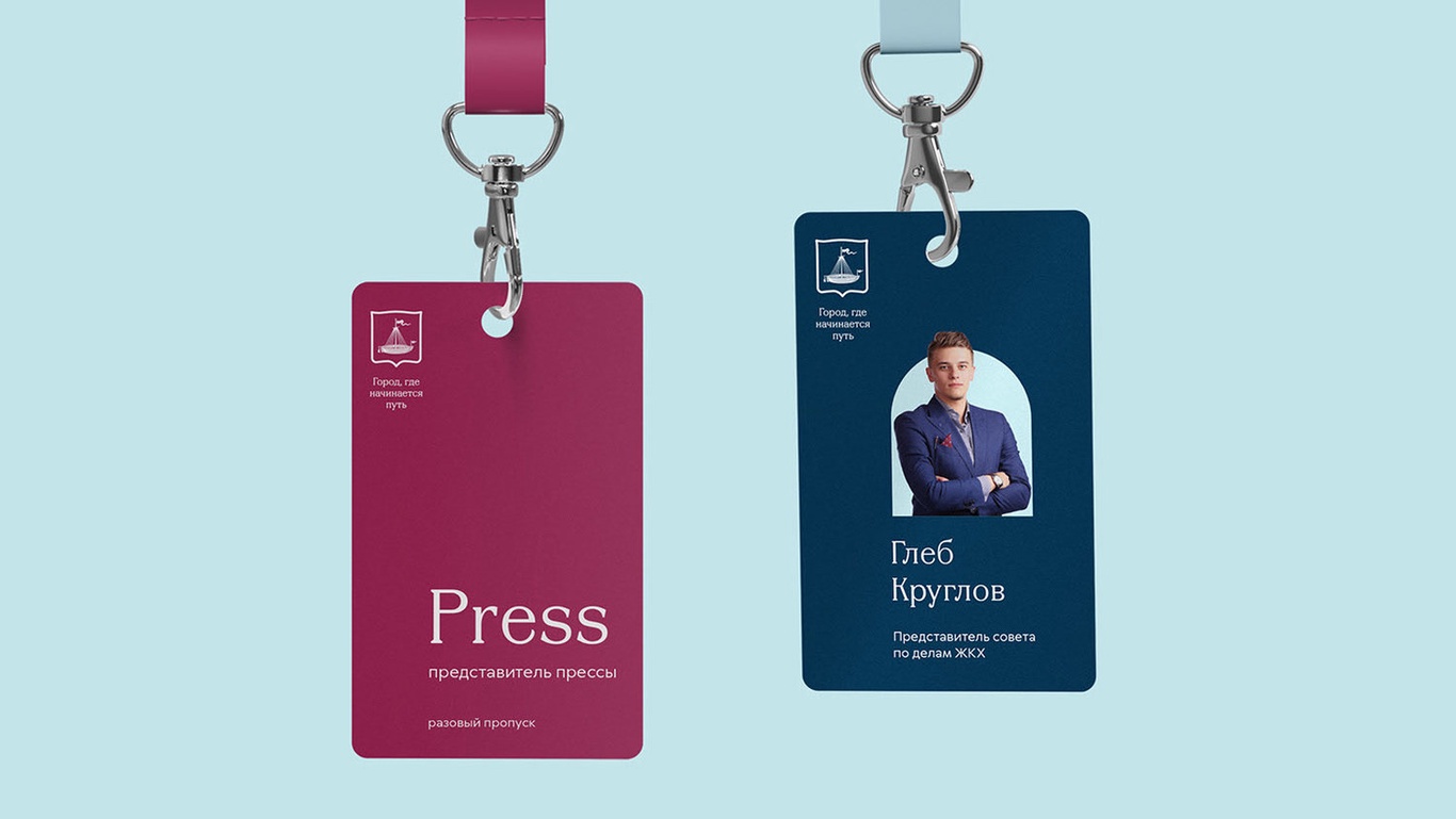
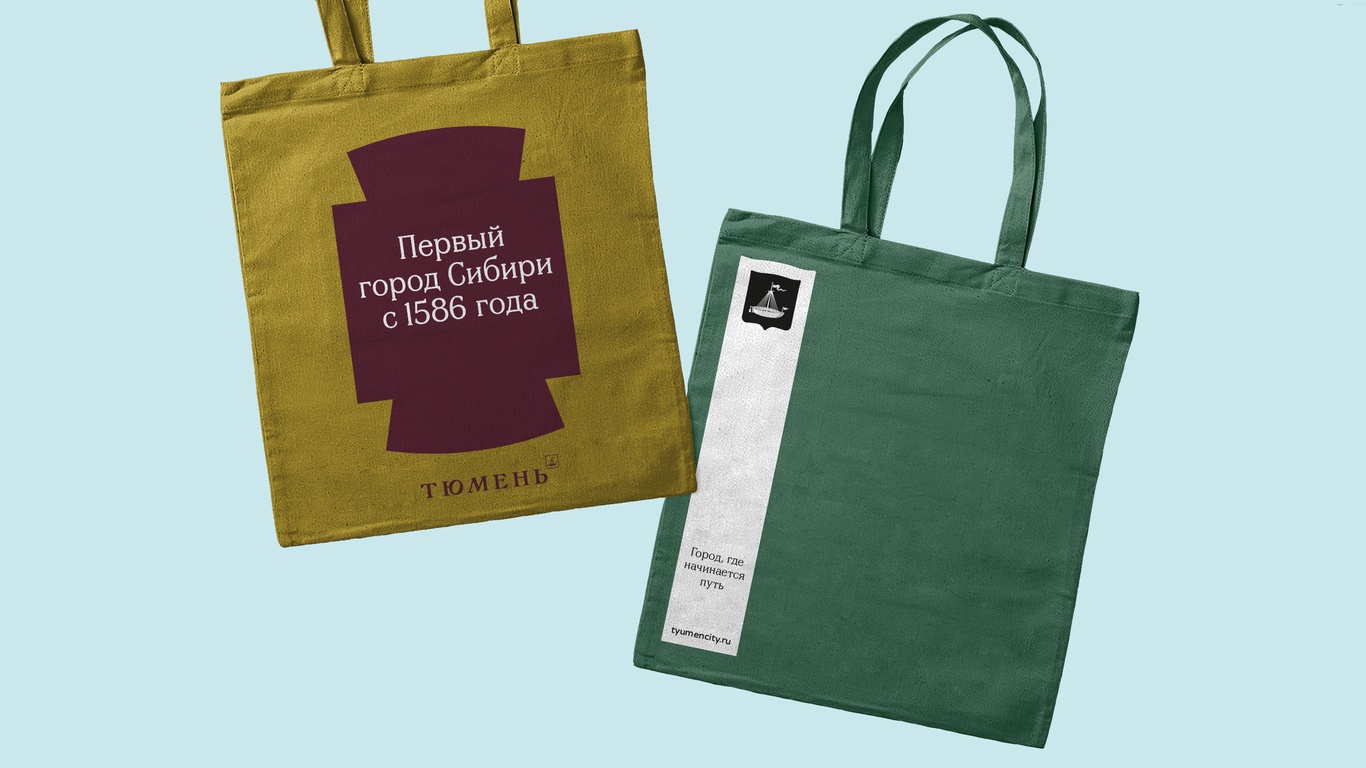
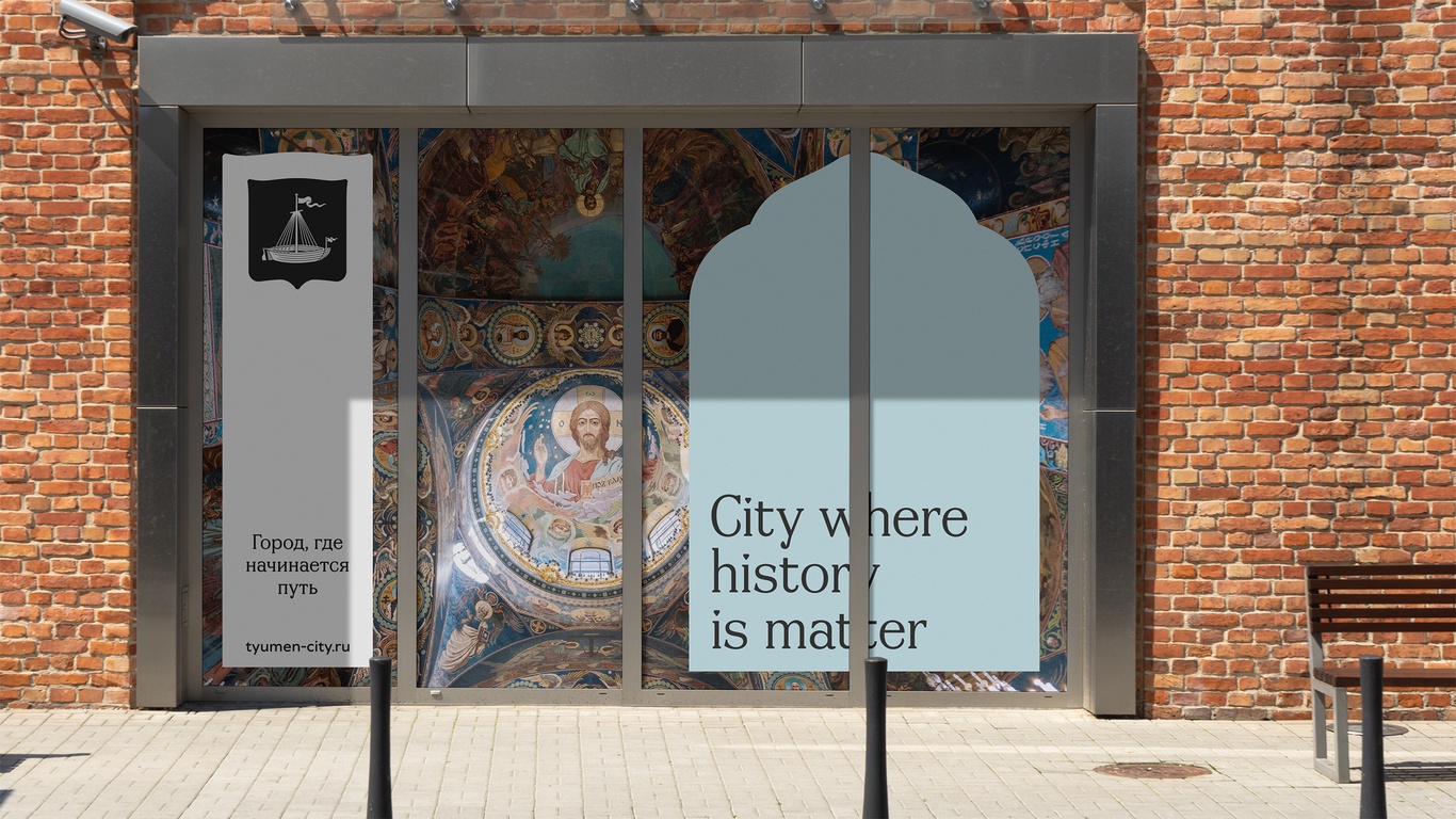
The recognizable architectural forms of the city have become elements of the corporate identity. Convenient containers for communication are used in advertising, souvenirs and streetwear merchandise collection.
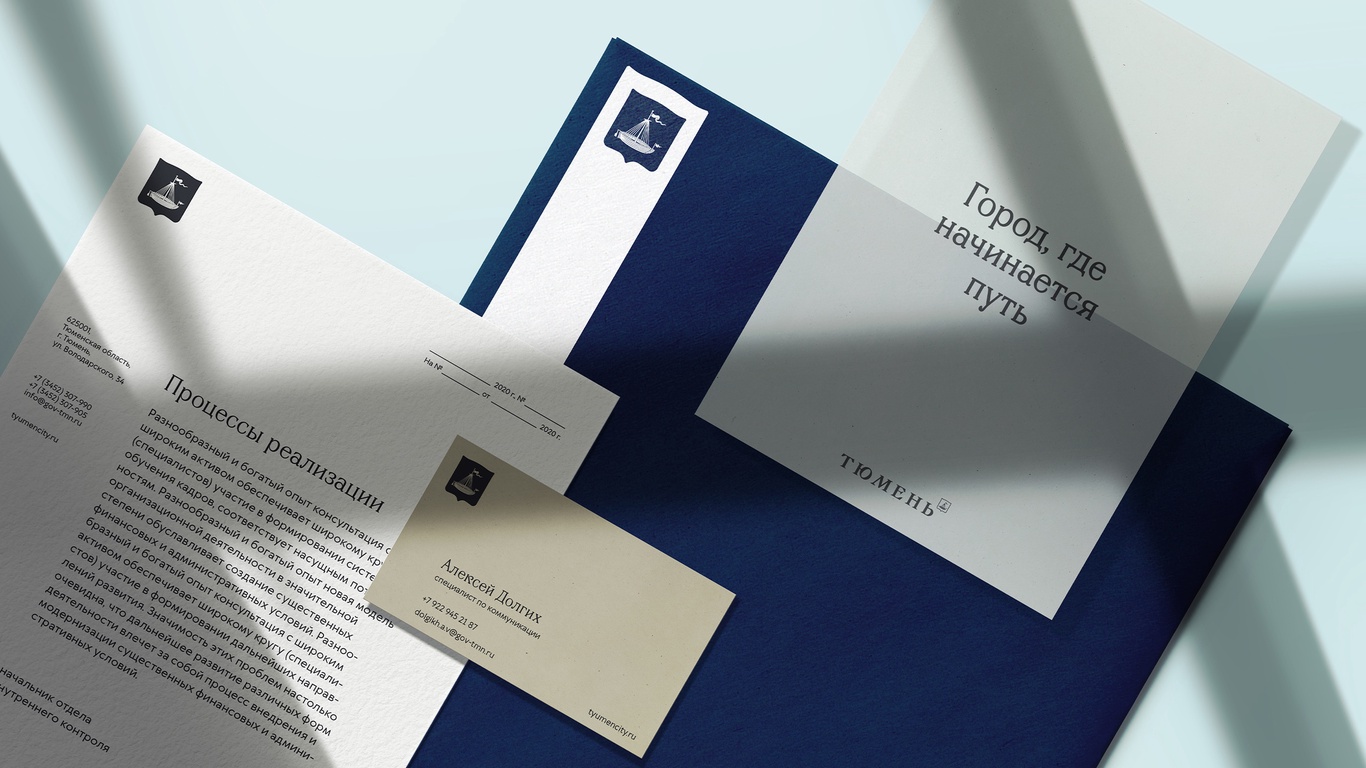
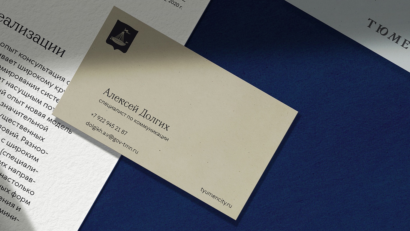
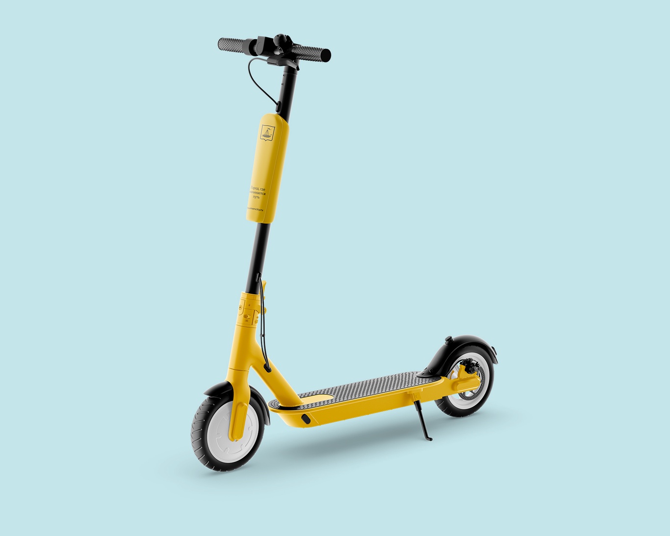
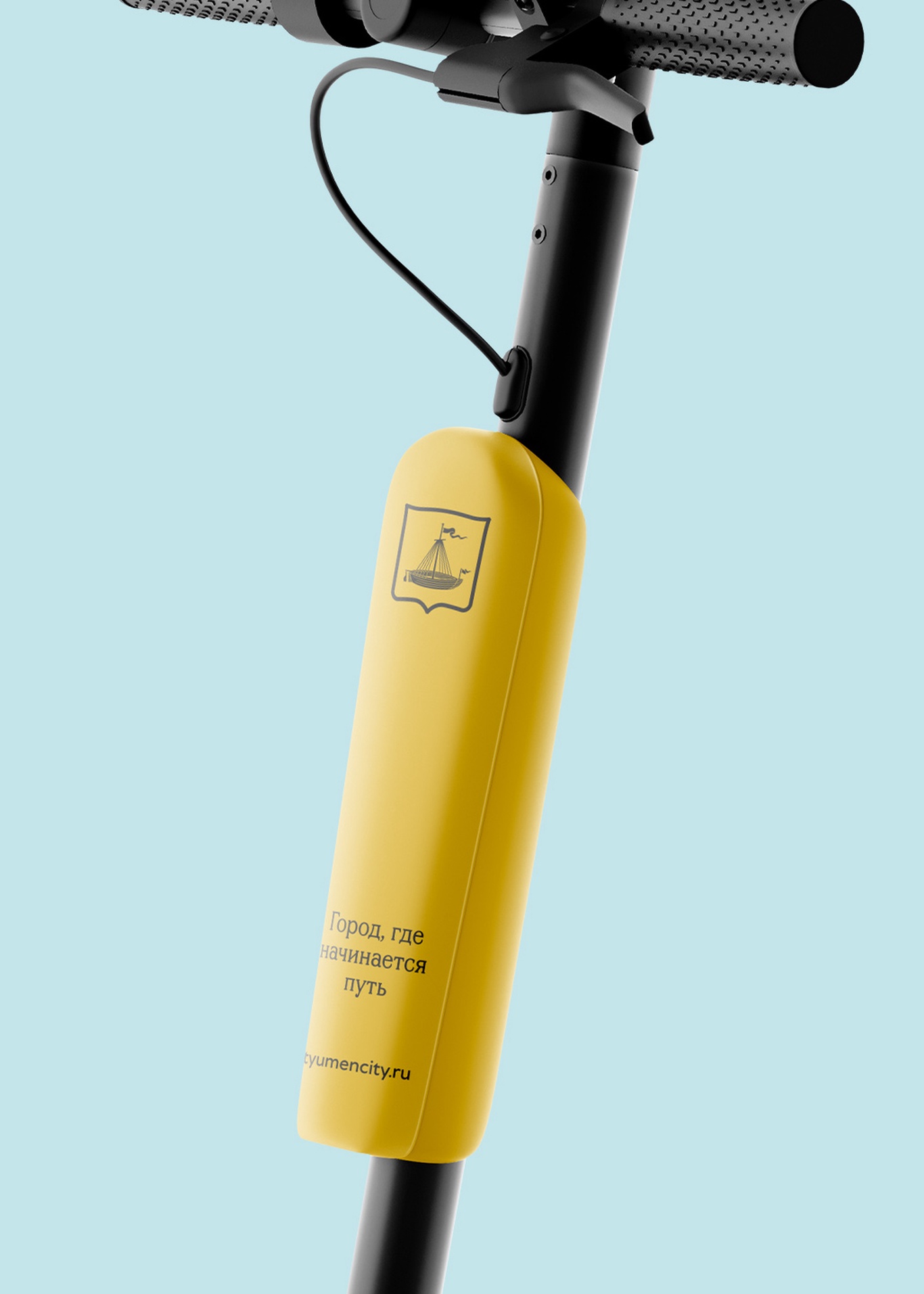
Advertising
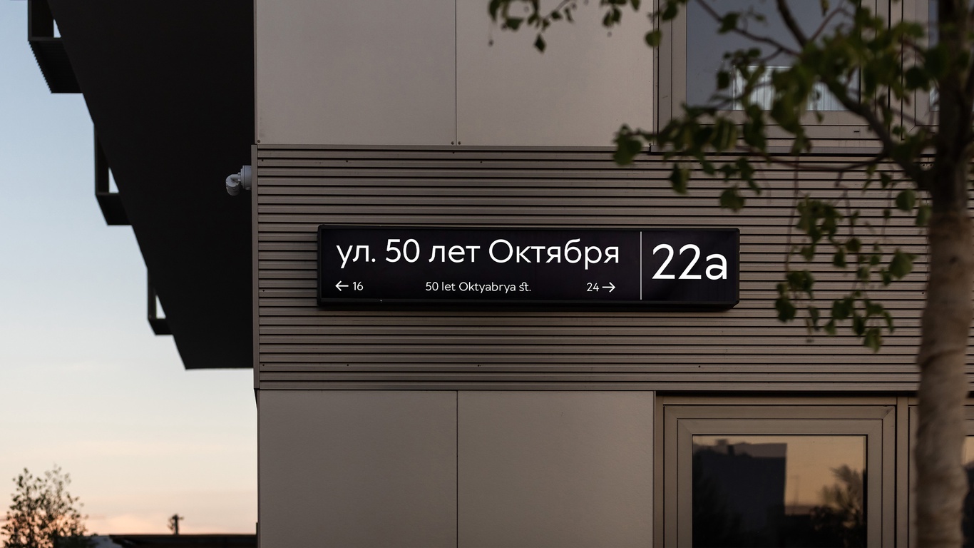
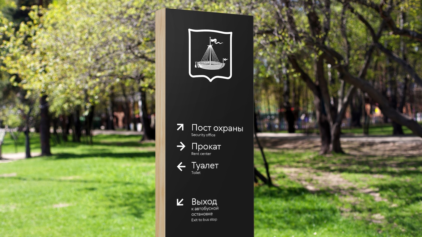
Wayfinding
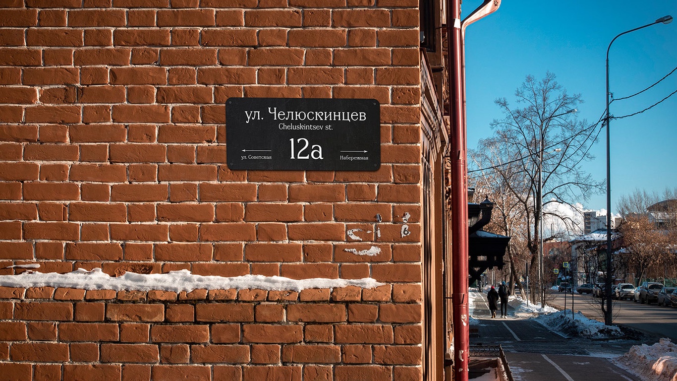
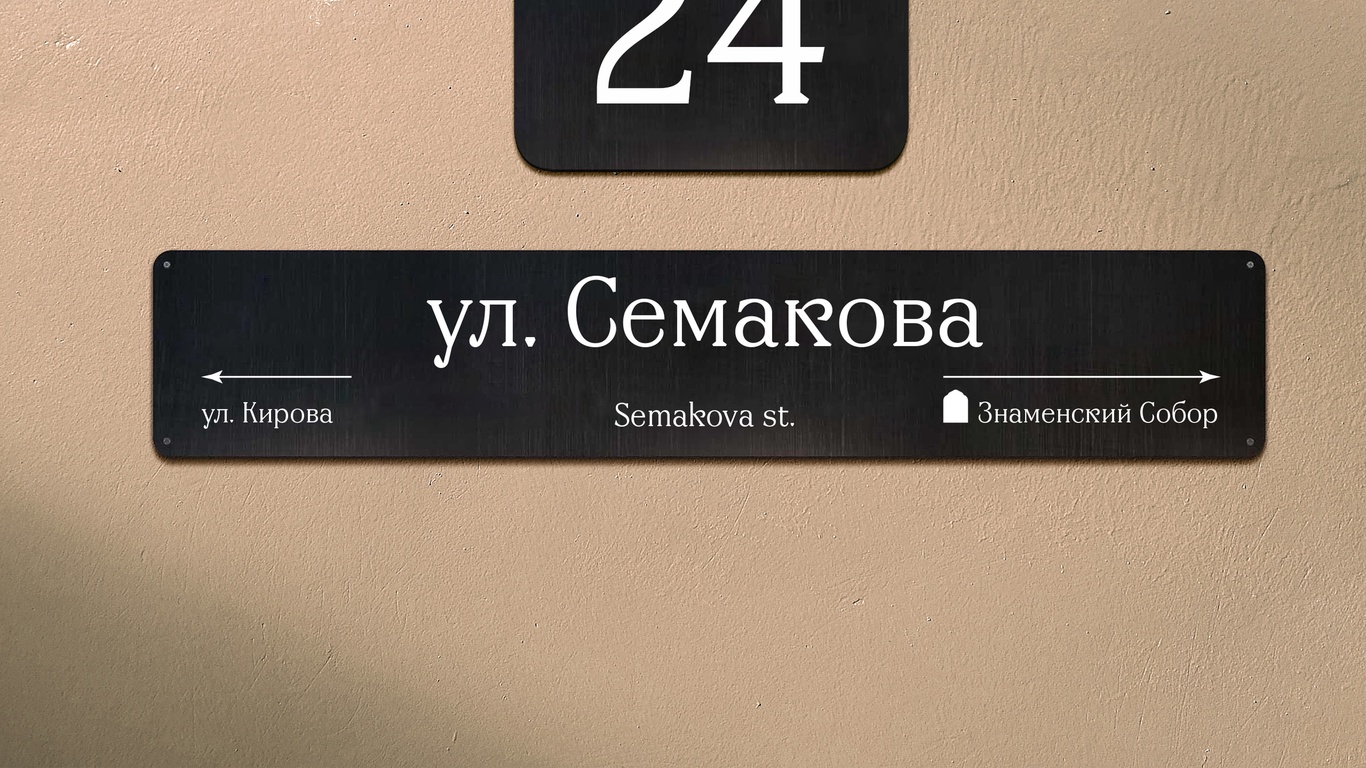
The urban navigation project is based on the historical gradient principle. In the old part of the city and on historical buildings, metal plates with branded antiques are used. In the new quarters, light boxes and signs made of composite materials with modern grotesque typography are used.
Merchendise
