
Oil Spill Museum / Музей разлива нефти


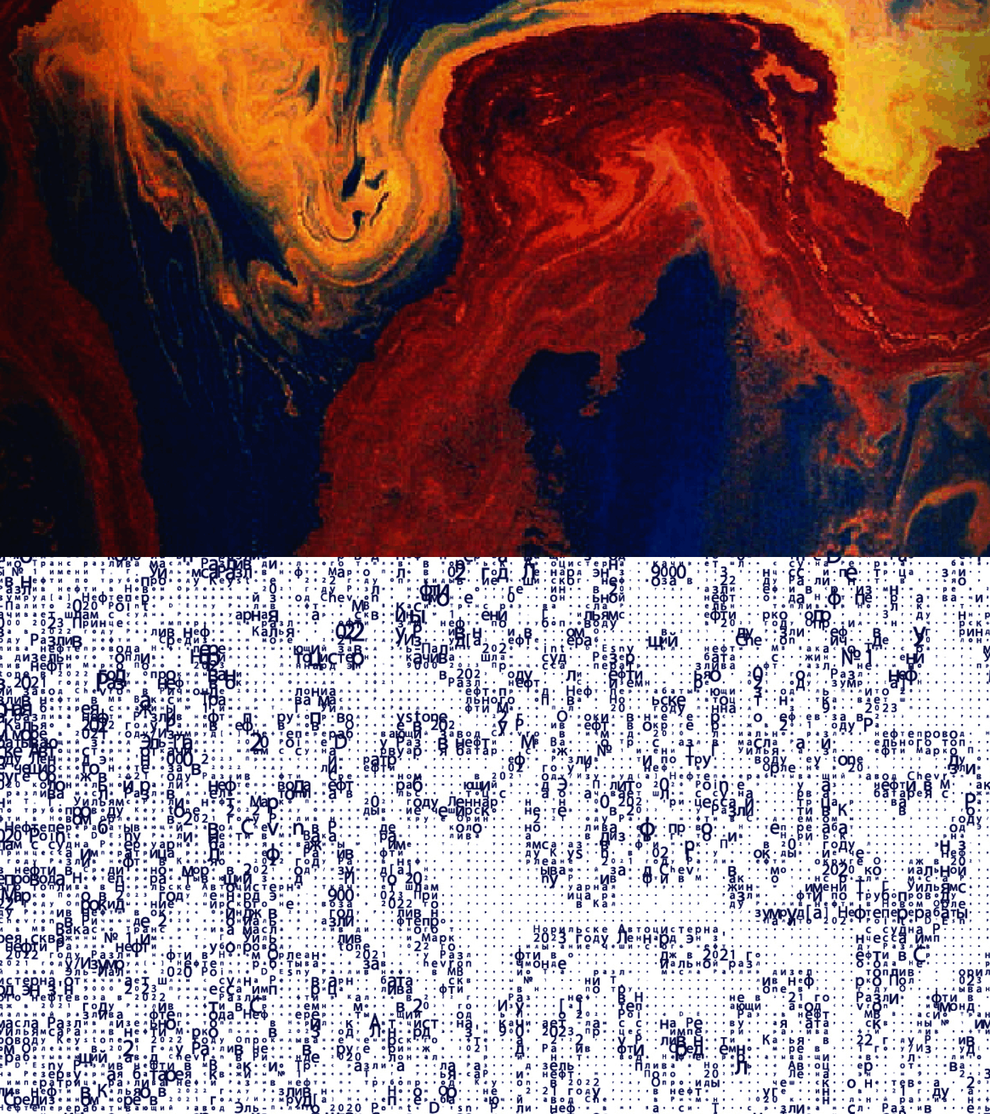
Oil Spill Museum — Identity Design for an Environmental Exhibition
/ Музей разлива нефти
Oil Spill Museum is an exhibition project dedicated to the largest man-made disasters related to oil and petroleum product spills in the 21st century. Oil is the engine of the global economy, but its transportation carries enormous risks. Spills on the surface of water bodies and land destroy ecosystems, kill animals and birds, and poison soil and water for decades.
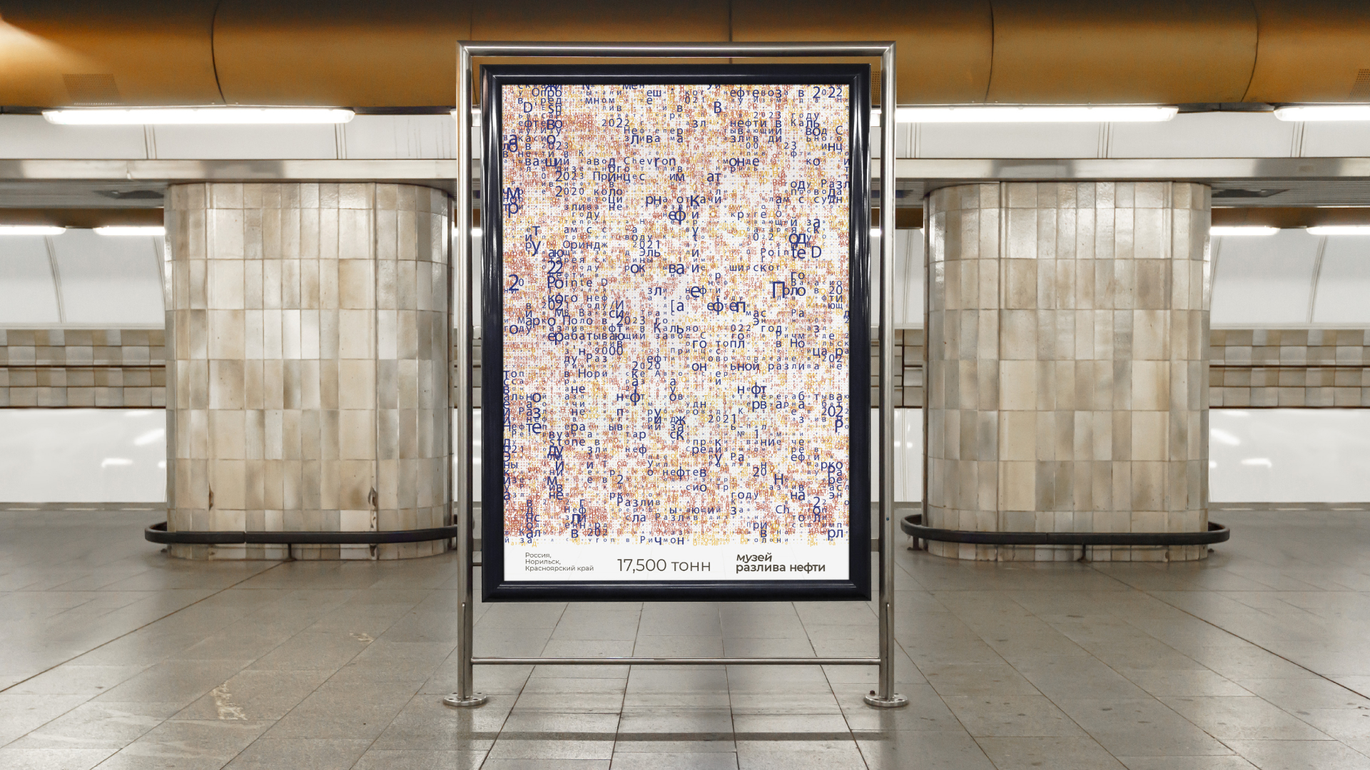
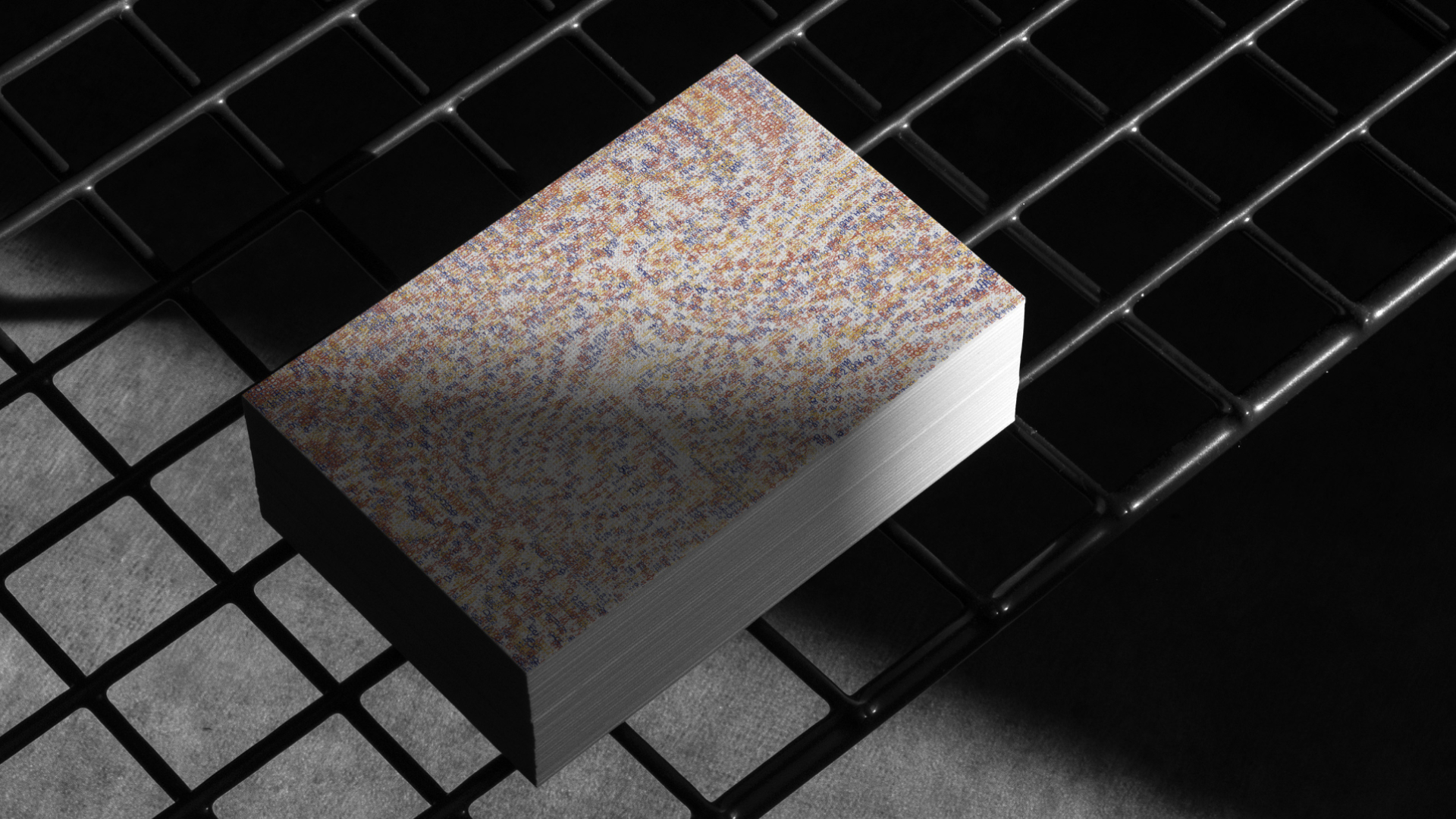
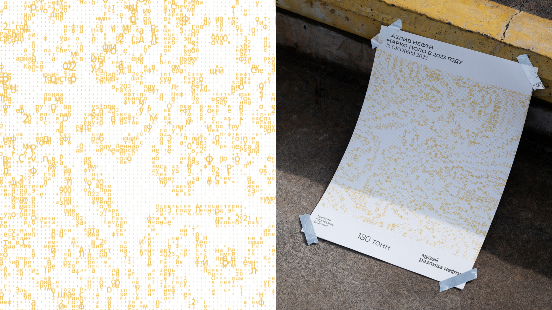
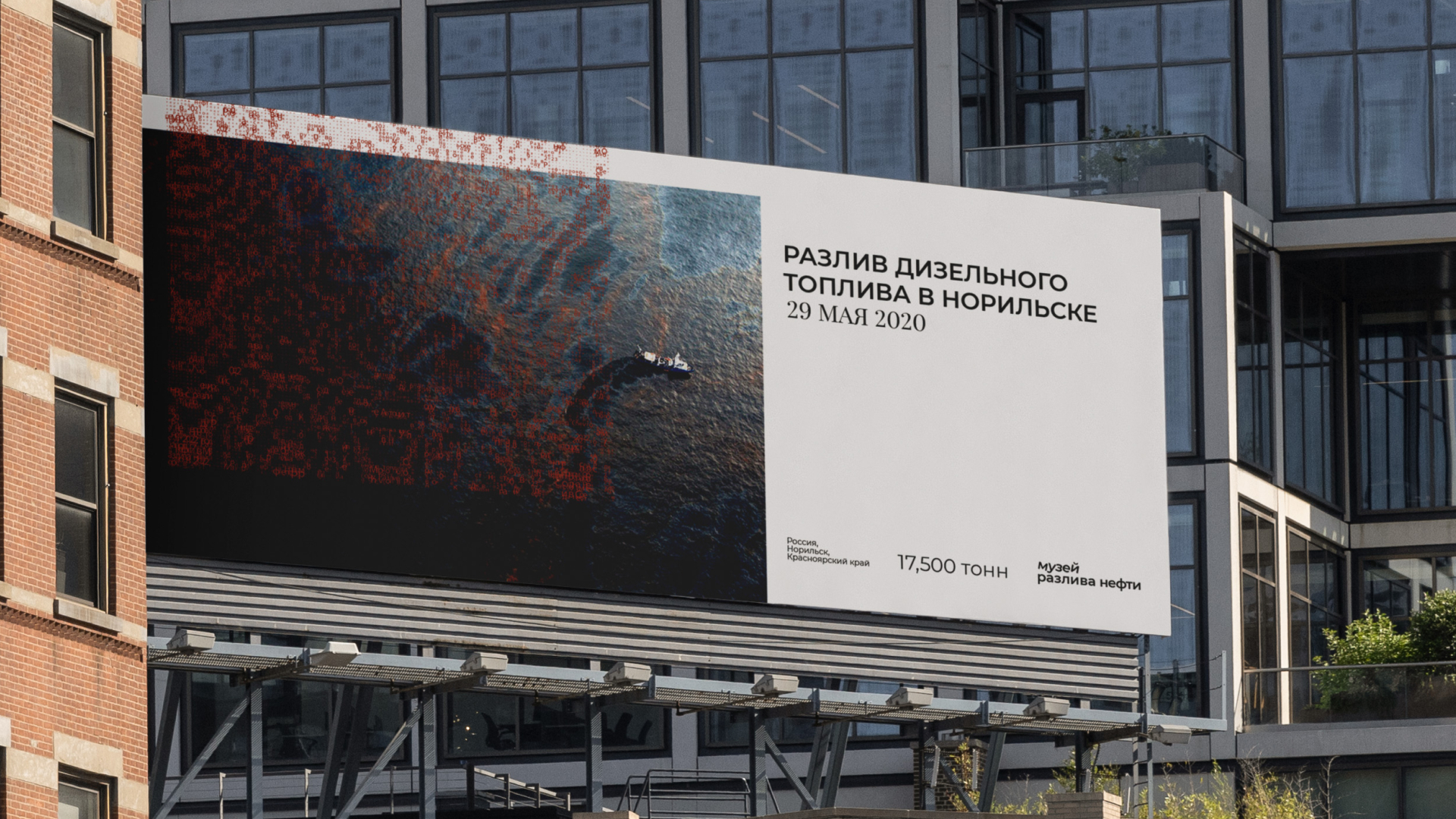
Identity development: The museum's identity is built on a minimalist yet emotionally charged typographic solution. The names of the places where disasters occurred — Marco Polo (2023, 180 tons), Norilsk (2020, 17,500 tons of diesel fuel), and other locations — become the main visual elements. Additional colors of the oil rainbow create the illusion of a spill right on the poster.
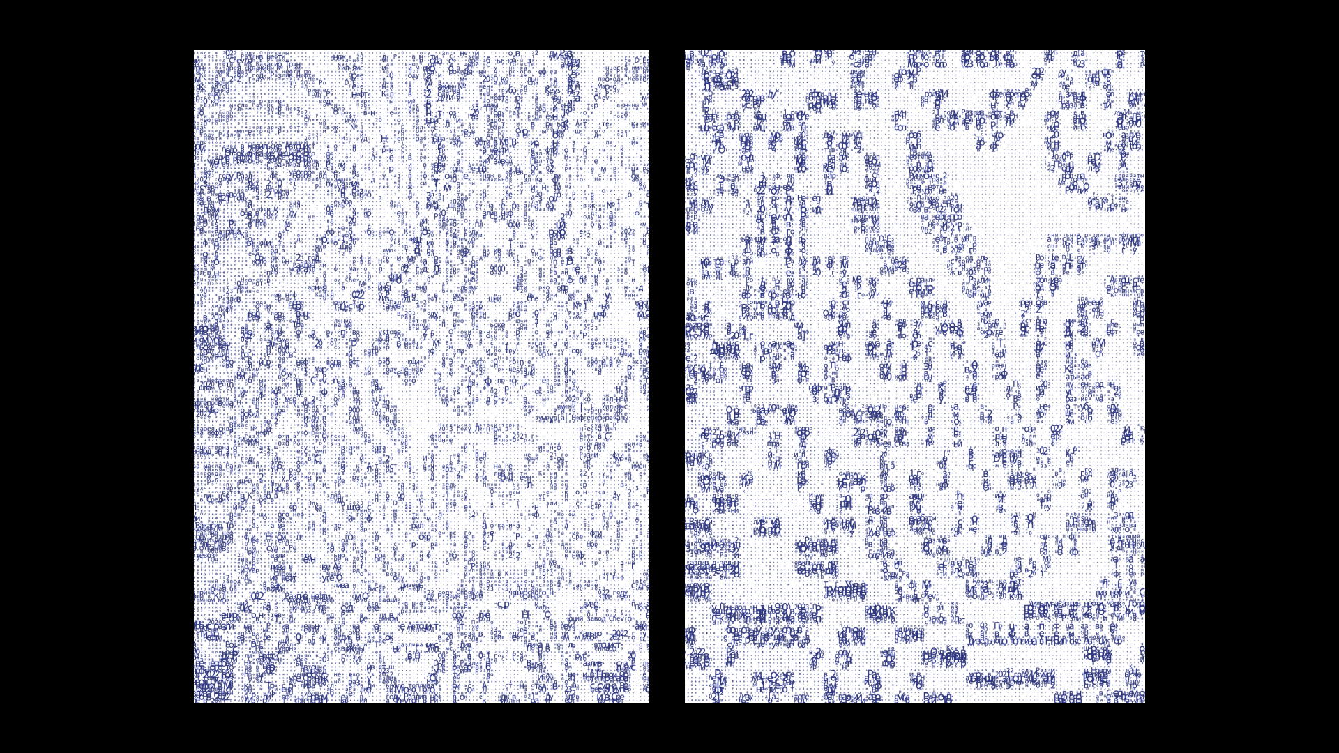
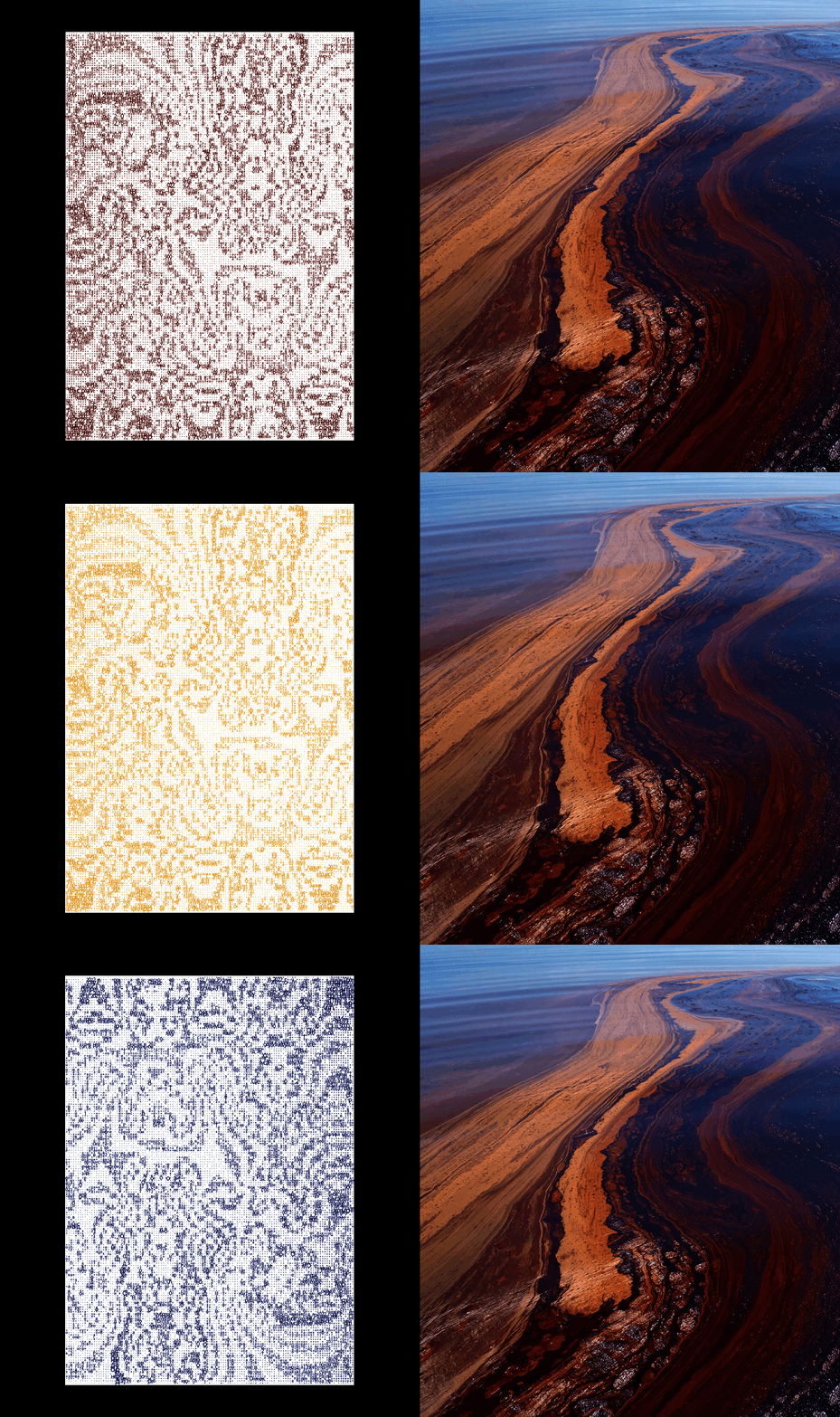
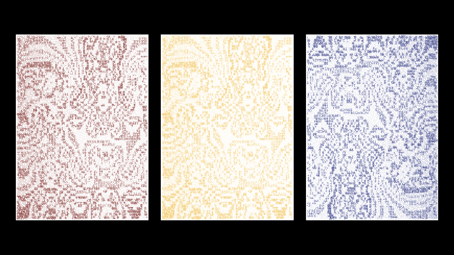
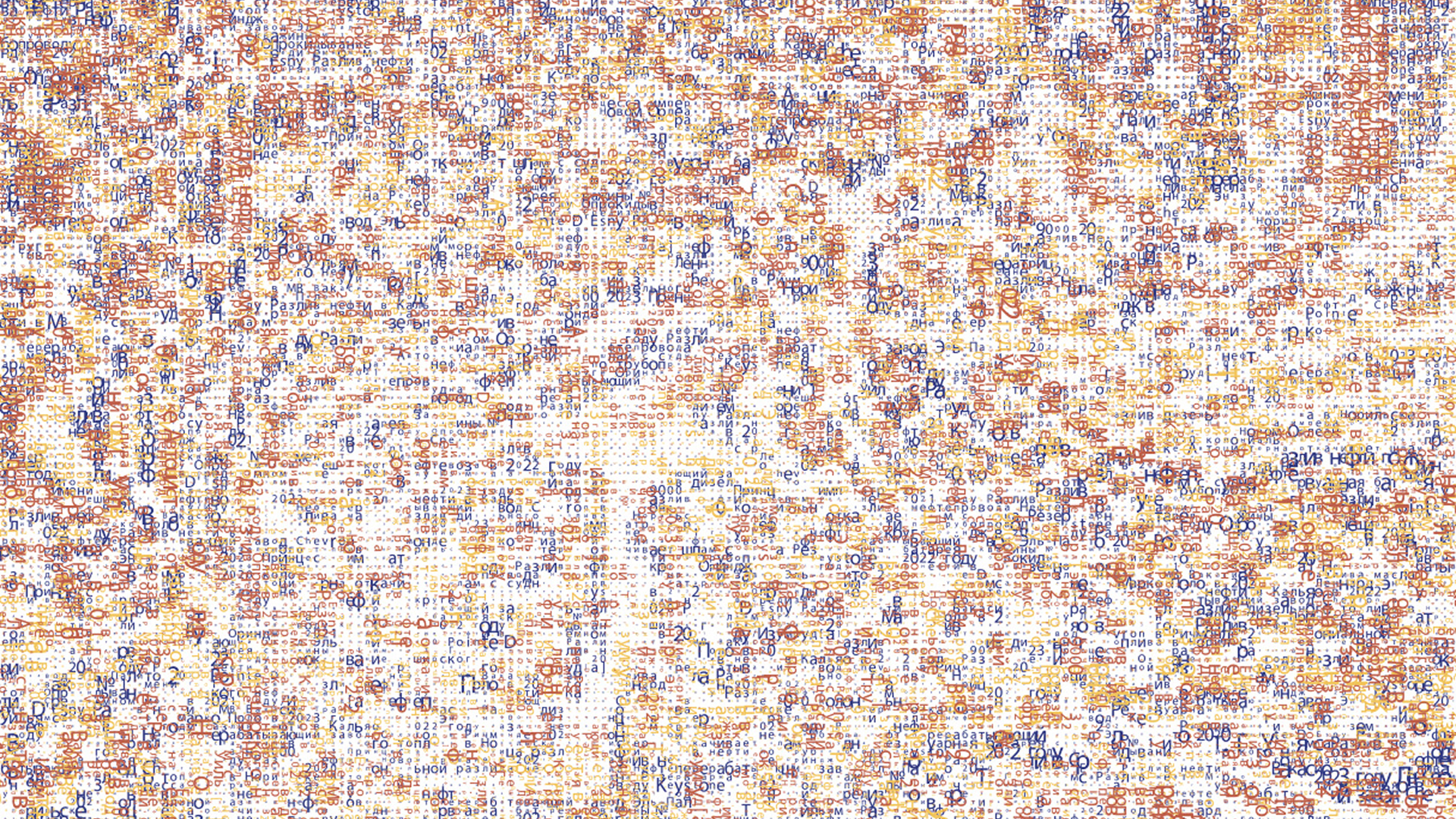
Strategic direction: Typography here does not just convey information — it itself becomes the disaster. The text spreads like oil on water. The numbers press down with their weight. The white space around serves as a reminder of what remains after a spill — emptiness.
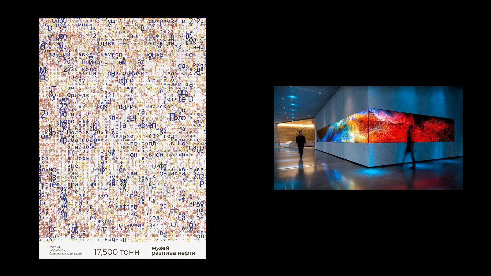
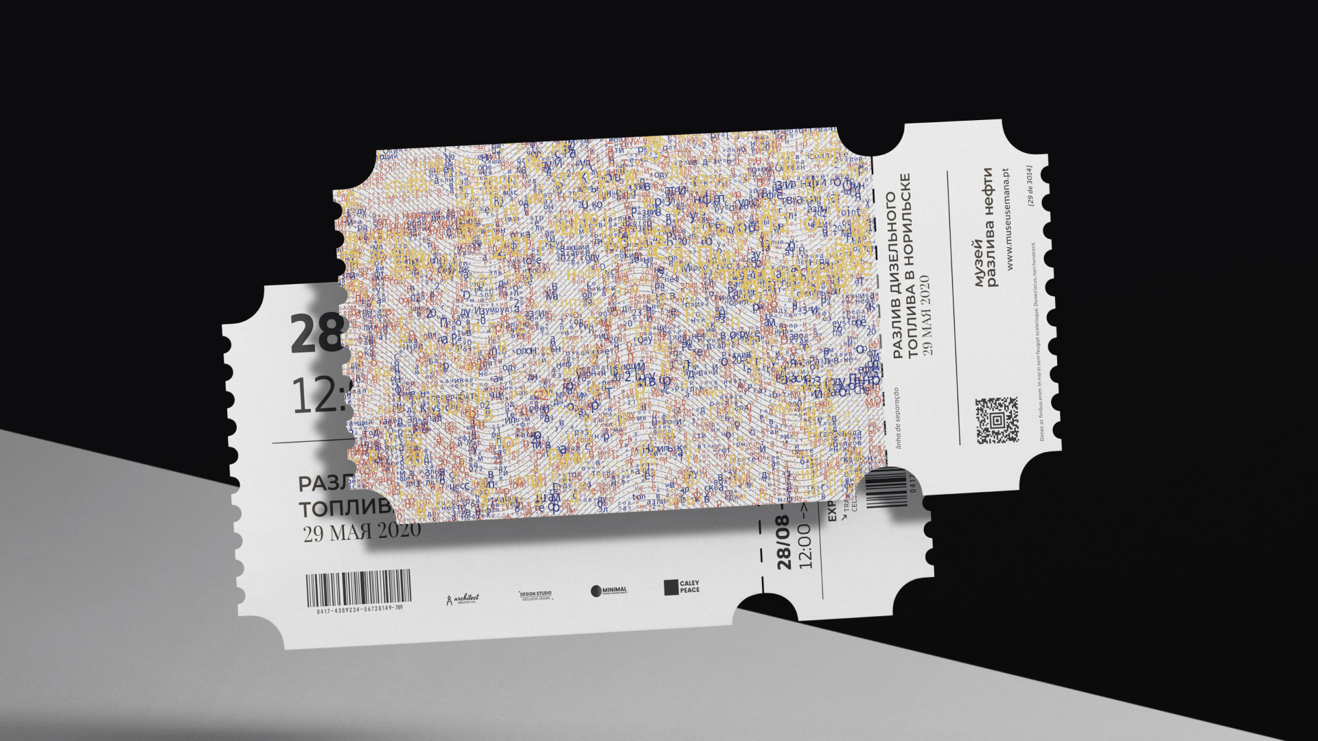
Audience: First, environmental activists and ecologists — the museum's design gives them a visual language. Second, students and young professionals in design, ecology, and journalism — the next generation of decision-makers. Third, the general public — those who live near oil extraction or transportation zones. For them, this museum is a wake-up call. The museum speaks to everyone who has ever seen a headline about an oil spill. The design forces them to stop, look, and feel the weight of what happened.
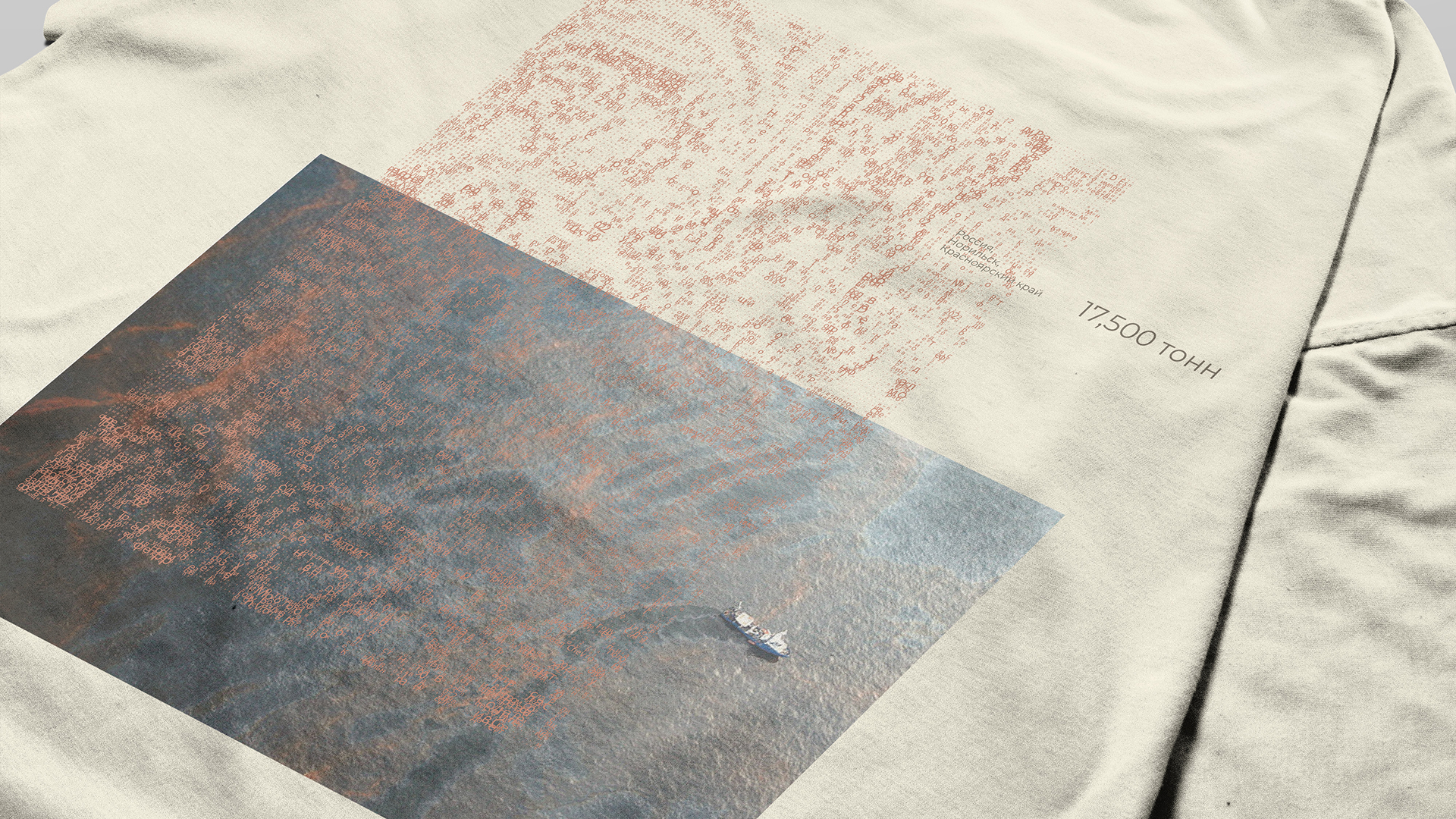
Conclusion: My design solution for the Oil Spill Museum will do three things. First, it will redefine what a museum's identity can be — no decorative elements, no illustrations, no escape into beauty. Only typography, data, and space. The names of disaster sites become the design. The numbers become the image. Second, it will create a lasting emotional imprint. Visitors will not remember a logo. They will remember the feeling of text spreading like oil across a satellite image — unstoppable, heavy, dark. Third, and most importantly, the design will function as activism. By making these disasters visible and unforgettable, the museum puts pressure on corporations and governments to prevent future spills.
This project proves that design is not neutral. It can take a side. It can mourn. It can warn. And sometimes, that is exactly what the world needs.
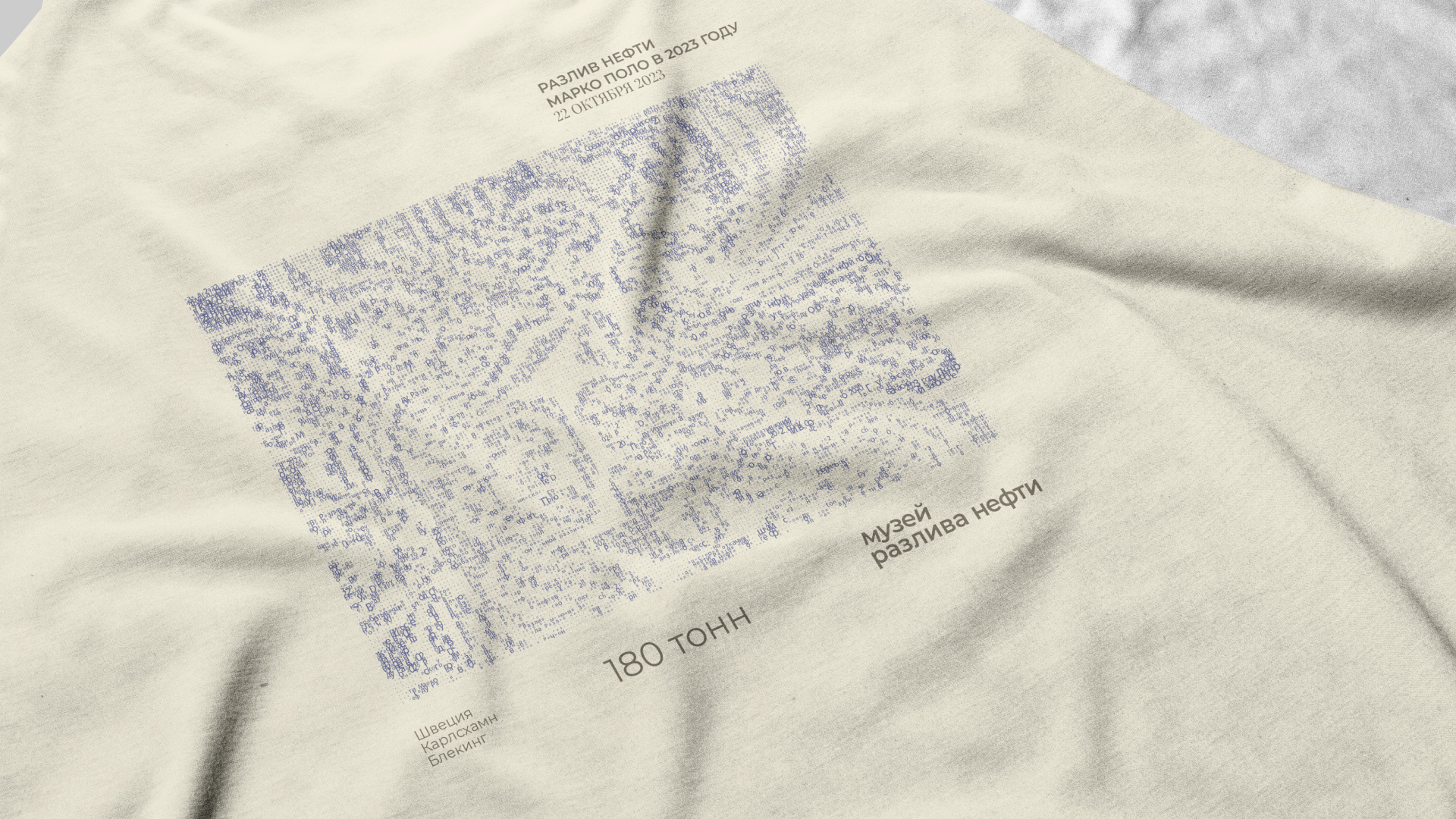
Музей разлива нефти — это выставочный проект, посвященный крупнейшим техногенным катастрофам, связанным с разливом нефти
и нефтепродуктов в XXI веке. Нефть — это двигатель мировой экономики, но её транспортировка несёт огромные риски. Разливы на поверхности водоемов и суши уничтожают экосистемы, убивают животных и птиц, отравляют почву и воду на десятилетия.
Айдентика музея построена на минималистичном, но эмоционально заряженном типографическом решении. Названия мест, где произошли катастрофы становятся главными визуальными элементами. Дополнительные цвета нефтяной радуги создают иллюзию разлива прямо на плакате.
Типографика здесь не просто передаёт информацию — она сама становится катастрофой. Текст растекается, как нефть по воде. Цифры давят своей тяжестью. Белое пространство вокруг напоминает о том, что остаётся после разлива — пустота.
Designer & Art Director: Dolinskaia Olga
email: dolinskiolea@gmail.com
Thank you!