
Леса Сибири | музей о вырубке леса


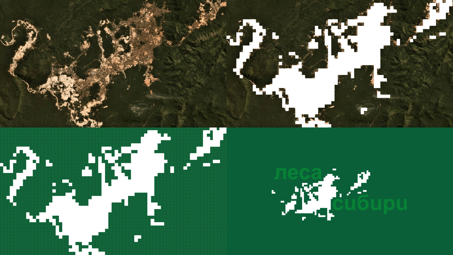
Forests of Siberia / Museum Exhibition Design
About the brand: The "Forests of Siberia" exhibition addresses the critical issue
of illegal and massive deforestation in Siberia, driven mainly by exports to China. The project is based on recent satellite images showing how dense coniferous forests have turned into eerie, stump-covered wastelands.
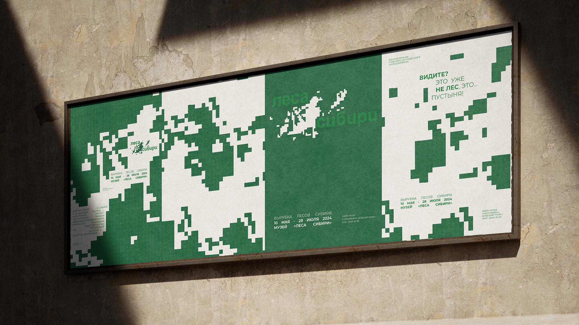
The core design concept: the white void as a metaphor for loss. Across all material — from layouts to posters — the empty white space progressively increases. With eachturn of the page, the white expands, consuming both the forest imagery and the informational text. The emptiness advances, leaving silence. Here, design
is not justa container for content but becomes the proof of the catastrophe itself.

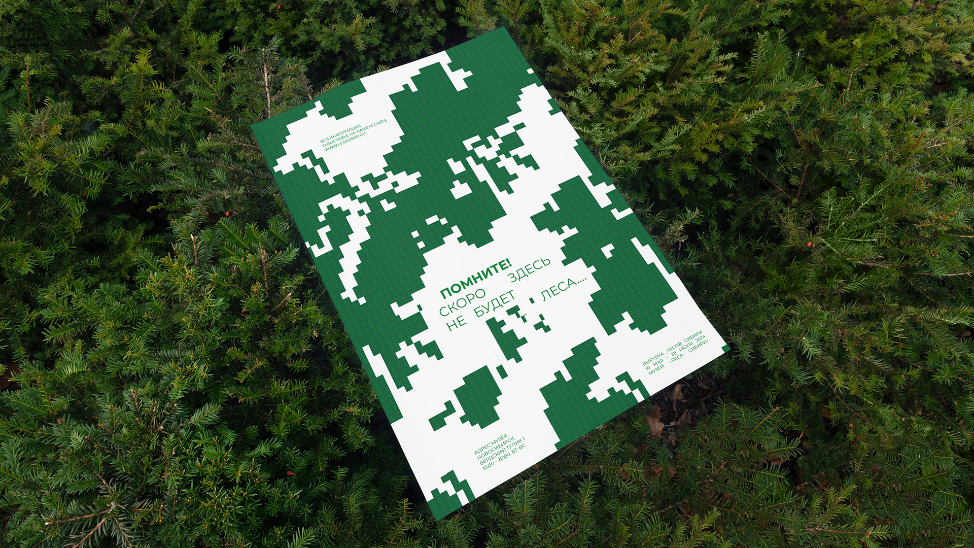
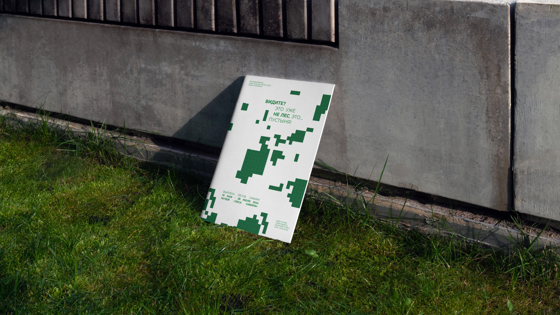
Strategic direction: Here, design does not decorate — it exposes. I want the visitor to feel that the system has failed, and that failure is the destruction of the forest. The ever-growing white emptiness demonstrates the speed at which the forests
of Siberia are disappearing — becoming less and less. My design solution does not comfort — it disturbs. And from that disturbance, care is born. The impact
of this project is not measured in the number of views, but in how many people, after visiting the exhibition, can no longer scroll past a news headline about deforestation.
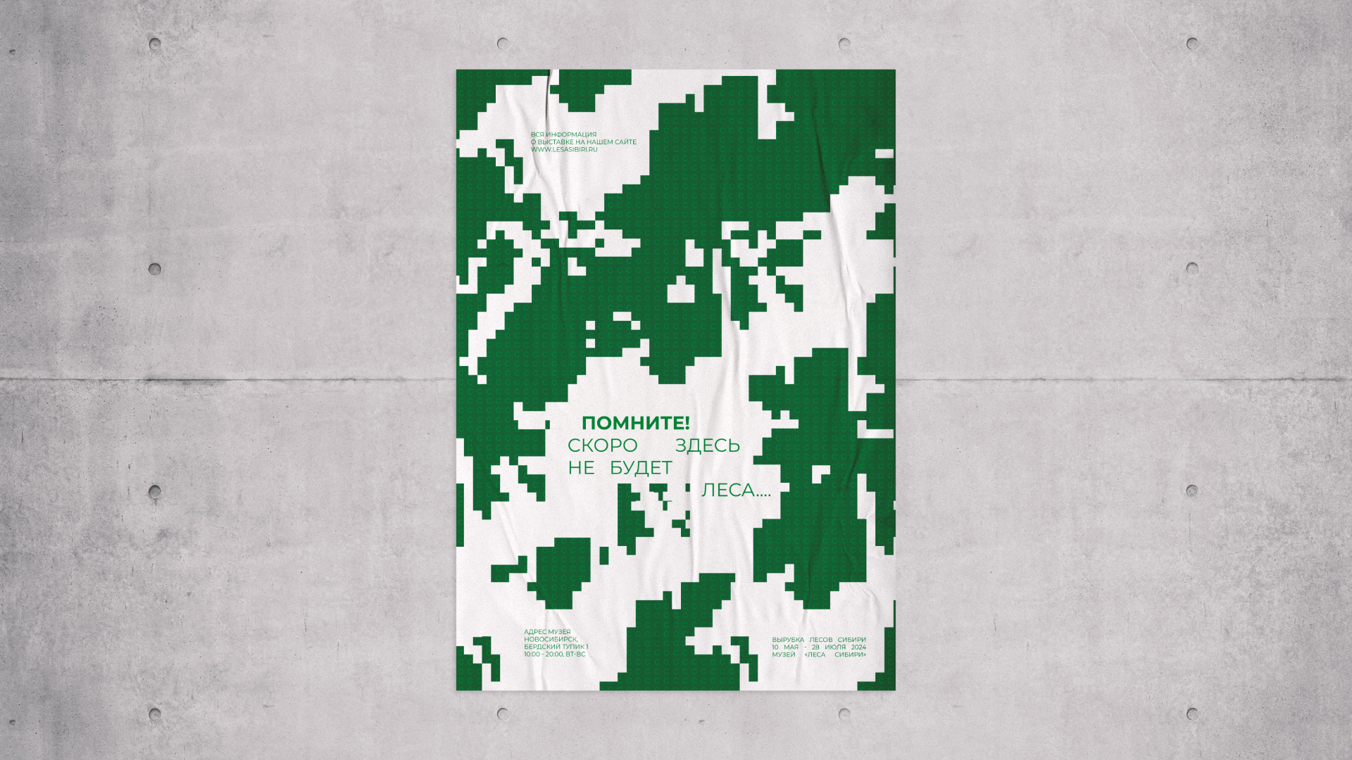
Identity development: The core design concept: the white void as a metaphor
for loss. Across all materials — from layouts to posters — the empty white space progressively increases. With each turn of the page, the white expands, consuming both the forest imagery and the informational text. The emptiness advances, leaving silence. Here, design is not just a container for content but becomes the proof of the catastrophe itself.



Audience: The project is addressed to an urban audience far removed from
the environmental problems of Siberia — museum visitors, students, people
who do not encounter deforestation directly. The visual language of "broken communication" is designed for those who are ready to read between the lines: designers, artists, journalists, activists. It is important that the viewer does not just receive information, but experiences discomfort — discomfort that forces them to stop and ask a question.



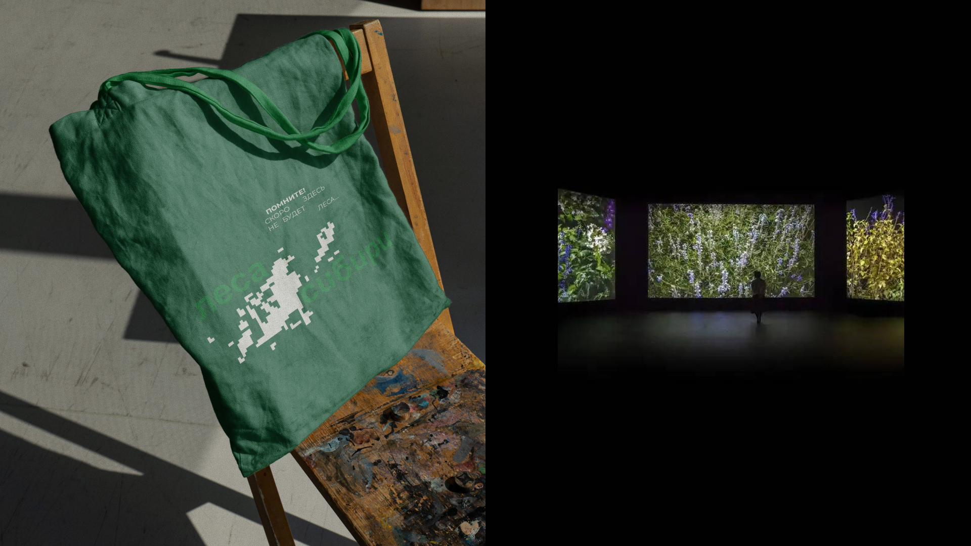
Environmental problem: "Forests of Siberia" is a museum exhibition project about the problem of massive deforestation in Siberian forests. The project is based on satellite images documenting how dense coniferous forests are turning into barren wastelands littered with stumps. Deforestation in Siberia and the Russian Far East is a large-scale logging process. It is criticized by the public as environmentally threatening.
The key visual device is the ever-increasing white emptiness in layouts and printed materials. It visualizes the speed at which the forest is disappearing:
with each poster,the white space grows larger, while the information shrinks.
The emptiness advances, pushing out both the forest and the words. In this way, design ceases to be merely a carrier of meaning — it becomes the evidence of the disaster itself.

Designer & Art Director: Olga Dolinskaia
Collaborations: dolinskiolea@gmail.com
Thank you!